Showing posts with label "Digital art". Show all posts

Saturday, 27 June 2015

Flight ready


I swore the arms would be done this week, and they are, just about.  All flight systems are on line and she's taxiing on to the runway - well, hopping would probably be a better description.  Hopping because she has legs and feet, as well as arms.  And as you can see from the picture at the top of the page, she has eyes as well.

As usual I began the arms on a separate layer, which was just as well as I've had to cut them up, and rotate them, and bits of them, and move them slightly back and forth over the shoulder region trying to decide what looked right.  And rub out parts of them and redraw and repaint gaps, and cut areas and generally curse and swear.  Was it worth it?  Hmmm, that's debatable.

As I said last week, I decided to have her holding a box instead of a scroll, because I thought that a scroll of the type I envisaged would be awkward and would obscure parts of the arms and chest of the bird.  And you have to be able to see that she's a bird with arms.  Both arms would also have to be pretty extended so I could show that she was unrolling a large scroll.  My sketches weren't promising.

Arms above the basic lines.  Note the gap at the right elbow where I cut it and rotated the forearm.
Above you can see the underlying lines with the arms placed over them.  They don't look right of course, and I've had to pay attention to the left arm, shortening it at the elbow and darkening it for shadow.  But the arms aren't to my liking.  I mess about with the shape of them, redrawing and colouring but I don't really improve them.  They look like a dolls arms, and even though this is an arch fantasy subject it should still look as real as that allows.

Seeing the arms with the rest of the colour layers.  Still no hands.
The box is now in place as well, and its position has migrated around the image by millimetres while I tried to finalise the arms placement.  I've also darkened the feathers just under the arms.  Then began to apply myself to the tricky problem of hands.  I didn't want to spend forever on the web looking for references, as that task can be endless.  You always think that if you look a bit harder you'll find the perfect image, and end up with masses, only to find when trying to use them that they don't really match with what you intended anyway.  But that means trying to 'busk' your way through it.

First hand in, and look at that box - it's slipped down the layer tree so its now under the hair!  I'll have to drag it up again.
Well, the first hand is in, and I'm not overwhelmed by the result, but soldier on anyway.  I manage to make a slightly better hand for the other arm that covers the box, but neither is brilliant.

The finished arms.  That box is a bit plain, it could do with some hieroglyphics or something.
And the legs, which I haven't really shown much of, are finished with scales toes and claws, and it's about this stage that I begin (in fact quite a while ago) to see how funny the thing is.  And that's the genius of those Egyptian painters that they could with a brush and some papyrus quickly and deftly depict this strange being and make it cool and attractive but not funny. 


The finished Ba bird - with added shadow.  Hah ha - sparrowlegs!
  And that's a lesson about approach and style more than anything else; those ancient artists needed images for a single well - defined purpose, to depict a mystic being in the papyruses of the Book of the Dead.  They needed to be quick, clean and easily identifiable.  They had the advantage of having to conform to a particular style, the flat side - on look of the Egyptians, and the images were small, so much so in fact that it's often difficult to see if it's male or female.  Simple, quick, clean.

So there it is.  The trouble with too many Ba birds is that the feathers get up your nose.  Something else for next week I think. 

My website

My Zazzle Page

Saturday, 20 June 2015

A head turner


Continuing the saga of the Ba bird, and I know that I promised arms last week, but a second thought is never a bad one.  Although I was quite happy with the colouring last week, I am still disappointed with the fairly dull manner with which the subject is presented.  Why didn't I do something with the wings?  Why is it so static?  But these are pretty familiar questions any artist will ask themselves, even when the work is actually better than they think.

However, I fear that this is worse than I think!  How to pep it up a bit?  What options might there be?  Well, changing the direction of the head is a good start.  We find it more pleasing when a figure is shown in full, if the head is turned in the opposite direction to that of the body.  This will apply even with a head to waist image.  It gives the body the illusion of motion and therefore life, and so adds more interest to a drawing or painting.  But we've got this far, is it worth turning back.  I think so, because you start a piece of work with a vision in your head of what you'd like it to be, and you have to struggle towards that.  If it means starting again or getting rid of a portion of the work then do it, because you almost certainly will do it better next time.  You've already gone through it once - look at the practice you've had!

The terrible deed is done - I sliced off her head and stuck it back on - brutal!
But I'll concede, starting again can be tricky, especially if you're painting on paper of canvas.  With this digital image there are certain things that make it easier.  She's floating on a layer, so I can cut her head off and flip it over.  Obviously there are some instances where this doesn't work, if the head is in an awkward position  for a reversal, but if its possible it's an easy thing to do.  Then you have the work of joining it all together again - that's what's putting you off isn't it?

In this case it's just a matter of hard slog, restructuring the neck to take account of the great tendon that shows when someone turns their neck (especially skinny people), the windpipe and the slight dip in the neck just above the collar bones.  Getting rid of the hair is easy enough, digitally sample the flesh colours near the gaps and begin to repaint. 

It looks a mess, but its all under control - no really - it is.
Then begin again on the feathers of the breast, so that they gradually blend into the skin.  Those pesky arms have got to fit onto the main torso as well, so whatever I do has to keep them in mind.  The fall of hair now on the left of the picture no longer has to move forward to go over the shoulder, and can hang straight, so this has to be corrected.

The neck now re-painted, with a few minor readjustments to the hair.
Now I'm forced to give some serious thought about the arms, because a. I need to know where I'm going to attach them to a structure pretty alien to human anatomy and b. because I'm a little worried about them, as my experiments along those lines haven't worked out very well.  The shoulders are the important starting points, where they are will dictate how the rest of the arms will look, so placing them in a convincing position is the next stage.
Just started to place the shoulders.
With this last picture you can see how I've approached that, and now hope to slowly build the arms up from this.  I originally said I would have her holding a manuscript - that's changed to a box.  So next week some arms, and maybe some eyes.

Visit my Zazzle store 

My Website

Saturday, 6 June 2015

Called to the Ba.


No, that isn't a typo in the title smarty-pants;  it refers to a type of exotic and mythical creature, part of ancient Egyptian religious beliefs.  I mentioned the Ba bird a few blogs ago, and stated that I'd like to have a go at illustrating it.  You may know, or remember from the last blog that the Ba was one of three spiritual entities believed by the Egyptians to inhabit the tomb of a deceased person after the tomb was sealed.

The Ba represented the character of the deceased, the thing that made them who they were.  Oh and did I mention that they're birds with human heads and arms, so, ideal for the average bird watchers notepad.  Ba's could travel around in the real world in any shape if they needed to, possibly putting right the misdeeds of the dead person, or seeing to last minute problems. (was that life insurance policy up to date?)  But they had to return to the tomb to witness the weighing of their masters soul before re-entering the body of the deceased.  A workload like that would ruffle anybodies feathers.

As usual with this digital illustration thing, I start to draw on a layer with a slate grey line as large as I want because I will shrink the drawing down, as I need more room.  This time round I decided to use a layer for a very rough sketch and brought the opacity down to three of four percent so the lines were barely visible.  I then put another layer above and drew the actual lines on this.  It helps you judge better where you really want the lines and the faint lines don't detract from a change of mind.
Beginning of the drawing with paint additions
I began with the head, as most artists do, and if it's a full face I start my line almost always at the point where the bridge of the nose slides into the furthest eye socket.  It's a good point to start, because its very easy to then judge where the tip of the nose and nostril should be, and from that you can then easily judge how much of the furthest side of the face should be visible.  Easier said than done I hear you say?  Well, maybe, it all depends how far down the road you are.  

Close up of the paint, showing the way shadows are placed.

  I probably show all the traits of lack of patience, as I want to start painting at once, and so begin to apply a yellowish base colour onto the same layer as the drawing.  I place in a slightly darker yellow for the first indications of shadows, and a yellowish grey for darker shadows, at all times avoiding true black.  The hair or wig will be a very dark reddish brown.  I use a grey brown and work it around the eyes, covering the eyelids, and fill in the spaces where the eyes will be with the yellow of the skin.

Grey shadows defining the nose, neck and eyes.  The spaces of the eyes are also filled with yellow.
The dark wig will have long trailing pieces hanging down each shoulder, across which the arms will cut.  I have placed a little light on the face, on the nose and cheekbone and around the mouth, but I'm keeping it low for the time being.  Here I have to admit that I'm not sure how the whole picture will look.  This is the basis of many of my failures over the years; I have a vague idea of what I want, but then try to make it up as I go.  However gradually I am getting a clearer idea, I want an image of the full Ba bird, holding a scroll of papyrus, as if showing it to the viewer.
Faint grey lines used to work out positioning of the arms and scroll.

This means showing the whole bird body, with its tail feathers and long legs.  I wondered at this stage how the Egyptians themselves depicted the particular birds they used in their drawings and sculptures of the Ba.  Were they one definite bird, and was that bird still around, or had it gone extinct, as I believe some of the animals of ancient Egypt have?   I was curious, as I wanted a guide for the feathers of the bird.  The Egyptians seemed to depict the birds in many different ways, sometimes as hawks, sometimes as stalks or cranes.  I looked online and found a common Egyptian bird that I liked and which seemed to resemble some of the ancient depictions - a yellow wagtail.  I'm less worried that this isn't authentic than I'm happy to have something to use as a reference. 

But I now see something more worrying than a bad choice of Egyptian bird.  The figure is becoming unbalanced, too elongated.  I need to concentrate on making the body smaller.  To make this work the bird should have a big head and a petite little bird body, with quite long legs and arms.  It's going wrong, but when that happens you have to fight it until it goes right.

Lets see what we have next week.

See my Zazzle page.

See my Website

Saturday, 16 May 2015

A real case


Kindles are fun and convenient, and I own one that has a nice robust black leather case.  I suppose I could custom paint the case but I am content with it as it is.  What would I paint on it?  Which character would please me?  I could do it with someone else's case if I knew what was wanted and in fact various web sites have started up to accommodate the case market, and some very odd images they have on some of them too.  I immediately felt that a reader would want a character or location from a favourite novel on their case.

This would be easy with older books that were out of copyright, and I looked at some of these sites hoping to contribute.  But the one I thought I might have a go with either went out of business or stopped the 'artist designed case', and went down the DIY route.  Hmmm, slippery ground.  The work I had been doing for them is still on my hard drive.  Again, it's character driven and illustrates old novels.  I recently read 'The Pickwick Papers', not, I have to admit, expecting to enjoy it - but found it to be brilliant stuff, charming, amusing and inventive from beginning to end.  So I promptly did two designs based on this novel.


'Let me tell the defendant Pickwick, if he is in court, which I am informed that he is, that it would have been more decent, more becoming, and in better taste, if he had kept away!'
I had seen the very underrated British film based on the novel, made about 1952, and this may have helped my appreciation of the book.  This is rare of films that usually fall very short of the book, but as the film has high production values and relies on Dickens' dialogue for its script pretty extensively; the finished product reflects the book pretty dam well.  It cuts out a few characters, but this doesn't harm the story such as it is, because the plot is fairly trivial, its one of those books that rely on verve, wit and charm to power you through to a feel-good end. 

The film chooses the cast well, making sure they realy resemble George Cruikshanks illustrations, using costume, hairstyles and lighting to great effect.  Donald Wolfit, an actor much derided over the years, was born to play the lawyer Mr Sergeant Buzfuz, he does an excellent job, and I had him in mind when I drew the character, with some of Buzfuz' speech included.  This image was designed around a case template supplied by the company I mentioned, and its their 'box' shape I had to design within.  I'd like to show the case as well, but I'd better not.  I've drawn a line around the case so you can see where it is.

The other Pickwick design I drew was of Sam Weller, and I chose the moment that Pickwick and his companions first meet Sam outside a hotel, where he is blacking boots and shoes.  Again, I would include dialogue from the book.


'You're a wag aint you?' - 'My eldest brother was troubled with that complaint', said Sam, 'Maybe its catching, I used to sleep with him.'
Lastly, Dracula, everbody's favourite vampire, and I obviously wanted a dark and brooding look for the image.  I've always liked a passage early in the novel where Dracula is describing to Jonathan Harker just what incredibly great nobles his ancestors really are!  He goes through a speech where he refers to 'mushroom growths' like the Hapsburg's and Romonov's, and how the Dracula's make them all look dog rough.  Then he finishes with a brooding but almost self- pitying line - 'I like the shade and the shadow, and would be alone with my thoughts when I may.'


'I love the shade and the shadow, and would be alone with my thoughts when I may.'
But the image is the thing, and I suppose the dialogue could be changed a hundred times over.  Will I actually put these designs up at any time?  Maybe on Zazzle, but they were not designed for their range of cases and I don't think they do any for Kindle - I'll check of course but in the meantime I'll keep investigating.

Implounge

Zazzle 

Saturday, 9 May 2015

Sphinx 2


Yes I’m well aware that the title sounds like the sequel to a particularly bad movie, but this is part two.  A week has elapsed and the sphinx is finished, although I still have that feeling that always hovers over you at the end of any project – that it could be better, and just a little more work would put it right (or put it wrong). 

 I know that more work on something when it seems to have finished can go either way.  You might hit on that elusive thing that makes all the difference, or you will do something (and often you’re not even sure what it is) that ruins it for you completely.  And you’re the one that matters in the end, your opinion.  Others may not even see a difference in the work – but you’ll always know that you almost had it right, but then ruined it. 

The line work at the bottom is looking a bit rough compared with the head.  Also it doesn't look balanced.

 I mentioned last week that I thought the design was in danger of being top heavy in detail and this is still one of the vague problems that are still slightly nagging at me.  There’s a lot of line work involved in the hair and wings, coupled with the fact that the human eye will always go to the face first.  In comparison the rest of the body has little line work to help it along. 

Its another one of those remarkable things about the human brain, that we will see flat two dimensional lines as representative of solid three dimensional objects, and without them a flattish colour based design is in danger of receding, and losing form.   I could only try to mitigate the problem by giving the body more form using blocks of shade.  What line there was defining the body was also in need of some work.  My first attempt wasn’t that great, a bit awkward in fact, and I needed to adjust the angle and line of the body between the legs, and the angle of the line of the haunches just behind the wings.  (See above.)  This helped it conform better to my original conception of a square like design, which would fit into a frame.  
 
Detail of the wings - and all those little fibres.
Another thing they don’t often talk about with art or illustration is the tedious work that some of it involves.  And I’m talking about the wings here, as I had started to draw in the thin fibres of the feathers and had to complete the task for every feather.  It wasn’t too bad this time, but I have locked myself into one of those seemingly endless tasks in the past.   The Sci-Fi artist Jim Burns talks amusingly in his collection ‘Transluminal’  about a similar but more testing problem for his book cover for the novel ‘The Long Run’. 

Getting close, but still some shading to correct, and some more sculpting of form.
 Lastly I wanted to slightly adjust the grey border, to make it narrower and longer.  I had originally wanted the front leg of the Sphinx to cross over the border but the positioning of the main form was too central, so I shifted it over to the right and lengthened the borders.  I wanted to put a title with it and so saw the opportunity for a box for this text to be made with the border. 
 
The finished article.  Click the picture and see my website.
And here's the finished piece, complete with a title in a box.  I'm never really happy with anything I do, so there's room for future work.  Maybe I might feel it would look better as a longer shape at some time and so I'll begin to break it out of its box and give it a more supple and elegant shape.  Would it look better?  I'm sure you all have an opinion, but only I and the sphinx have the real answer to that riddle. 

Zazzle 

Flickr

Saturday, 2 May 2015

Sphinx


I’ve mentioned before that I really like Art Deco, appreciating its cosmopolitan ways, in taking from anywhere and everywhere – and everywhen.  It has taken elements from all cultures and all time periods and blended them together, usually in to a highly successful whole. 

Ancient Greece was an obvious target for Art Deco artists to re-use and the sphinx, a mythical creature common to Greece and Egypt easily attracted their interest.  Deco was influenced by Egypt as well, so they had no shortage of sphinxes to choose from.  I’m going to tackle a Greek style sphinx, as might have been imagined in the thirties. 

 Almost all materials were used by Deco artists, as it was an arts and crafts movement, so when I began to design and develop a digital image in the style I chose to make it look like a polished steel or aluminium sculpture in repousse or hammered metal style. 

I imagined a kind of plaque like decorative sculpture of the type found commonly in decorative material for buildings and interior spaces in the twenties and thirties.  You can also see these sorts of design in Deco glass and stoneware.  They’re often attached to buildings over doors or windows, or pressed into glass partition panels, and this is a long-term form for the decorative arts.  Only Deco seems to have done a great deal of this kind of thing with metal.
 
Beginning the drawing.
  I started with a drawing of the face and head, because I wanted it to look right for a Deco design, with the hair that might have been seen in the thirties (where a sphinx gets her hair done is anybodies guess – but they must be one hell of a hairdressers,) and the rest of the design – as always grows out from this. 

 I knew the hair was going to give me trouble.  It always does.  Designing flowing hair, or draperies for that matter is always difficult, and you’re almost never happy with it.  I rubbed out the hair several times because it looked lame, concentrating less on spiral like shapes and more on flowing locks of hair.  I’m a little concerned that the hair will look separate from the rest of the design, too intricate, with nothing to balance it.  

The overall design was going to be a squareish form, so that all the elements of the figure fitted into a block.  This would make the figure seem squat but this is a form that Deco often experimented with for its figures.  So for instance, the outer line of the face follows the same line as the outer edge of the body. 
 
Progress on the hair.
  The wings are next, naturally forming from the rest of the work, as if the upper part of the design has to be finished first.  I find it interesting to see what parts of an image naturally form first, and why we always find ourselves progressing to very particular parts of a design, always finishing them first before moving on; and of course, everything has to fit into that box I’ve set myself to work in.  
 
The wings form.
 The wings are work intensive, just getting the curves correct is a little difficult and they have to look a particular way.  I suppose its derived from not only classical sculptures, but medieval and Neo Classical ideas.  Sculptures of everything from sphinxes to griffins to angels have almost a set of rules for wings.  I won’t say I know those rules, but I’m trying to conform to that look in hopes I’m doing something right.  I can’t help putting a little colour (if tones of grey can be termed colour) on to the image, even without it being finished – just to see.  Next week I’ll say something about the completion.


Saturday, 25 April 2015

Those mermaids again.


Mermaids are popular girls; images of these leg-challenged ladies always attract interest.  Some of the highest hit rates on my Flickr page are for the mermaid designs, so obviously I thought – I’ll design some more. 

The Art Nouveau artists of the 1890’s were nutty about mermaids, and they went to town on the swirly hair and a type of stringy seaweed, which I think is called ‘Bladderwrack’.  (It is, I just looked it up – Fucus Vesiculosus.  There – don’t say I never tell you anything.)  

Though interestingly, if you put the keywords ‘At Nouveau mermaids’ into Google, then go to the images tab, almost all of the so called Art Nouveau pictures are modern.  What this says about Google or us, I don’t know.  Only after scrolling to about half way down the page do you find any real 19th century works, and they’re few and far between.

Some of the real swirly girly Art Nouveau by Alphonse Mucha.  Public domain
  So I suppose we like the ‘idea’ of Art Nouveau more than we like the actual stuff.  Which is lucky for me as I now intend to add to the ever-growing heap of fake Art Nouveau.  

For this design I had intended on a circular effect, but I couldn’t make it work.  I’d wanted to rotate copies of the figures I designed around a circle and have them interlock together.  Fat chance of that.  It would need more work on the design.

At the top of the page is a small scan of a rough pencil drawing, one of many, which help to try things out and define an idea.  I then drew on paper a bigger version with both figures and scanned it so that I could use it as a template.  I put the scan on to a layer, and then bringing down the opacity so the drawing was just visible, created another layer on top so that I could then trace the drawing through.  

Left, the line drawing, top right, tracing over the original drawing, bottom right, colouring.
You have to zoom in on the work and draw with a thin pencil tool line, but when you know you can correct mistakes easily its not too stressful.  I used black for the outline, and a darkish grey to put in line shading.  Then, it's just a matter of adding a layer below the drawing and applying colour.  I'll admit its not exactly as I envisaged it but I've improvised a simple background (which I may change) and for the moment its finished.  Here it is.
Finished, with space for a caption.

And here's a link to my Zazzle store.


Saturday, 18 April 2015

A ghost of an idea.


This blog I suppose is at the wrong end of the year, as it should coincide with Halloween, but this little poem, or limerick floated into my field of vision and I immediately thought ‘I could design something for that'.

Three little ghostesses,
Sitting on postesses,
Eating hot buttered toastesses,
Greasing their fistesses,
Right up to their wristesses,
Oh what beastesses,
To have such feastesses.

I’ve always liked that image, three ghosts sitting on posts eating toast.  What’s not to love?  It’s not exactly T.S.Elliot but it gets its message home in a clear and direct manner.  However there are some quite ambiguous things about the whole piece, for instance, that first line.  Three little ghost-esses?
What do ghosts look like?  This is the dreaded (and rather ridiculous) Smithfield Ghost.  The Welcome Trust.
 Does that imply that they are female?  But as ‘esses’ appears at the end of each line maybe not.  But it does raises the issue of what ghosts are supposed to look like anyway.  Before you draw anything, you have to know in a general way what it looks like.  This is what M. R. James thought about the ‘look’ of a ghost 

‘What first interested me in ghosts? This I can tell you quite definitely. In my childhood I chanced to see a toy Punch and Judy set, with figures cut out in cardboard. One of these was The Ghost. It was a tall figure habited in white with an unnaturally long and narrow head, also surrounded with white, and a dismal visage.


Upon this my conceptions of a ghost were based, and for years it permeated my dreams.’
 
M. R. James.  (1862 - 1936)  Wiki commons.

So that was James’ idea of their appearance, and as he was born in 1862 it was probably the prevalent nineteenth century conception.  Our modern idea of a ghost looks more like the ‘Caspar – the friendly ghost’ variety, but where did that come from?  I suppose he derives his appearance from the typical bed sheet with holes cut in for eyes.  I think those late 19th century ghost fake photographs also informed our modern idea of a ghost – people dressed in long white robes, double exposures and all that stuff about ectoplasm.


 A little while ago I did these cartoons of ghosts in the modern style.  I think they derive something from the film ‘Ghostbusters’ in its realisation of ghosts as more coloured ectoplasm, the light gleaming and rippling on their surface, more bloated jelly than amorphous will ‘o the wisps.
 
My kind of ghost, chains, flaming torches, skulls and little Vandyke beards!
 There’s also a little of the past about them, traditionally ghosts are always supposed to cry ‘vengeance vengeance’ or ‘woe is me’, they clasp their hands in anguish and of course where is any self respecting ghost without a number of chains to rattle?   They also often carry torches, have ropes around their necks and might just possibly carry a club. 
 
A toast!  To toast.  I love toast

I've been doodling some tryouts for the nursery rhyme at the top of the page, and its a bit more difficult than I expected, so nothing finished yet, but here's the sketch.  It will become the basis for a design for my Zazzle shop, and in the meantime why not visit it by clicking on the photo.

Saturday, 11 April 2015

Dreaming of electric dogs.


Nobody really needs a robot dog.  We’ve got plenty of real dogs; look around they’re everywhere.  The US military are working on some large dog like robots (not designed to specifically look like dogs, the only similarity is that they have four legs,) these ‘dogs’ are designed to carry heavy weights over rough terrain, therefore giving support to ground troops.  But what I really mean are the small silver plastic robot dogs that can’t carry heavy loads, and probably only function as a good way of tripping somebody over. But we seem to have plenty of them if the Internet is any thing to go on.  And I believe its because the Japanese really want robot dogs.  I mean they really want them.

 And as I began designing the images I’m showing today, it became more apparent just how much they really want them. 
 
With added battery acid!
 I remember in the late seventies and early eighties experts sagely nodding and saying that there won’t really be humanoid robots.  Because robots don’t need to be humanoid, they can look like anything, like a great big arm swivelling about while it welds a car together or a computer.  There see, a computer doesn’t look like a person does it?  No, it’s just a box you big silly!  No arms, no legs, no eyes; just a big number crunching television in the corner.  These experts obviously hadn't counted on the Japanese.

Like the rest of us imagining thirty foot tall robots shooting death rays from their eyes, the Japanese smiled politely and said – ‘yes we understand, no humanoid robots.’  But deep down they were thinking – ‘but I want humanoid robots – and robot dogs as well!  And some cats!’ 
 
The kind of robot dog the Japanese really want.  Public domain.
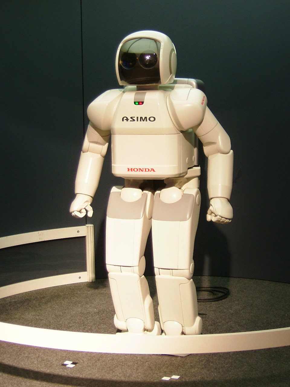
Of course they were pretty well placed to make them, having ruled the roost in computer technology and robotic engineering for the last thirty years and are a fairly dogged and stubborn race in more ways than one.  And so, the Internet is swarming with pictures of the various toy robot dogs that are available.  They don’t do anything but walk or trot around, (I think they are sometimes employed in five-a-side football teams,) and look in varying ways like (or unlike) dogs.  And of course, humanoid robots are everywhere.  Take Honda’s Asimo project. 

  Asimo, (Advanced Step In Innovative Mobility) is a strange, huddled looking robot, about the size of a ten year old, but which has achieved some extraordinary goals.  It can walk up and down stairs, kick a ball, do an approximation of running, and greet presidents of the USA as seen in the picture. 
 
Asimo greets president Obama.  Public domain.
But my flippant tone isn’t intended to disparage the work.  Asimo (with the correct software) can even recognise faces and small objects such as toy cars and can then retrieve a specific toy car from a group of cars of different types. So he examines the toy, remembers its shape and can then go into another room and from a table of other toys find the exact car.  These tasks must have robotics scientists tearing their hair when they try to explain to the rest of us just how significant that it.  It doesn’t seem like much when you just write it but we are seeing the robotic future being built before us. 
 
Asimo. Wiki commons.
 Today’s designs are simple line designs again, inspired mainly by the Japanese dog toys; the ones at the top of the page are fairly early tryouts against a yellow background with a nice gold glow.  Easy to draw freehand, pencil on paper but they look a bit rough on examination.  I am always looking for my clean line and so redrew them all digitally, giving them a nice blue finish.  I shall probably change that (remember CMYK colour doesn’t do blue very well) but it looks well in red, and green will work well too.  The actual dogs, like modern cars are invariably silver, but that won’t necessarily work as I’d have to do it grey.  They’ll all have glowing eyes though. 
Would you like this design on a t-shirt, mug, mousepad or bag?  Just click on the picture.
Asimo is completely white except for a black faceplate, and looks like a miniature NASA spacesuit with a mind of its own, and I suppose that one day they will actually put astronauts out of a job, or at least make them into desk bound remote viewers, pushing buttons on earth while the robot does the work in space.  But of course we should remember those seventies boffins who told us that robots don’t need to look human – they certainly won’t need to in space. 

And they said valve technology was dead!
My humanoid robot designs are similar in approach to the dog ones, and look a bit like Asimo, while I was researching pictures, I found an image of a very similar robot playing the trumpet, but I did mine long before I saw it.  Honest.  And even as I write another robotics laboratory in Japan is designing another robot dog.  They really want them – really.

My Zazzle site

The Implounge.