Showing posts with label "Diary of an Imp". Show all posts

Saturday, 11 April 2015

Dreaming of electric dogs.


Nobody really needs a robot dog.  We’ve got plenty of real dogs; look around they’re everywhere.  The US military are working on some large dog like robots (not designed to specifically look like dogs, the only similarity is that they have four legs,) these ‘dogs’ are designed to carry heavy weights over rough terrain, therefore giving support to ground troops.  But what I really mean are the small silver plastic robot dogs that can’t carry heavy loads, and probably only function as a good way of tripping somebody over. But we seem to have plenty of them if the Internet is any thing to go on.  And I believe its because the Japanese really want robot dogs.  I mean they really want them.

 And as I began designing the images I’m showing today, it became more apparent just how much they really want them. 
 
With added battery acid!
 I remember in the late seventies and early eighties experts sagely nodding and saying that there won’t really be humanoid robots.  Because robots don’t need to be humanoid, they can look like anything, like a great big arm swivelling about while it welds a car together or a computer.  There see, a computer doesn’t look like a person does it?  No, it’s just a box you big silly!  No arms, no legs, no eyes; just a big number crunching television in the corner.  These experts obviously hadn't counted on the Japanese.

Like the rest of us imagining thirty foot tall robots shooting death rays from their eyes, the Japanese smiled politely and said – ‘yes we understand, no humanoid robots.’  But deep down they were thinking – ‘but I want humanoid robots – and robot dogs as well!  And some cats!’ 
 
The kind of robot dog the Japanese really want.  Public domain.
Of course they were pretty well placed to make them, having ruled the roost in computer technology and robotic engineering for the last thirty years and are a fairly dogged and stubborn race in more ways than one.  And so, the Internet is swarming with pictures of the various toy robot dogs that are available.  They don’t do anything but walk or trot around, (I think they are sometimes employed in five-a-side football teams,) and look in varying ways like (or unlike) dogs.  And of course, humanoid robots are everywhere.  Take Honda’s Asimo project. 

  Asimo, (Advanced Step In Innovative Mobility) is a strange, huddled looking robot, about the size of a ten year old, but which has achieved some extraordinary goals.  It can walk up and down stairs, kick a ball, do an approximation of running, and greet presidents of the USA as seen in the picture. 
 
Asimo greets president Obama.  Public domain.
But my flippant tone isn’t intended to disparage the work.  Asimo (with the correct software) can even recognise faces and small objects such as toy cars and can then retrieve a specific toy car from a group of cars of different types. So he examines the toy, remembers its shape and can then go into another room and from a table of other toys find the exact car.  These tasks must have robotics scientists tearing their hair when they try to explain to the rest of us just how significant that it.  It doesn’t seem like much when you just write it but we are seeing the robotic future being built before us. 
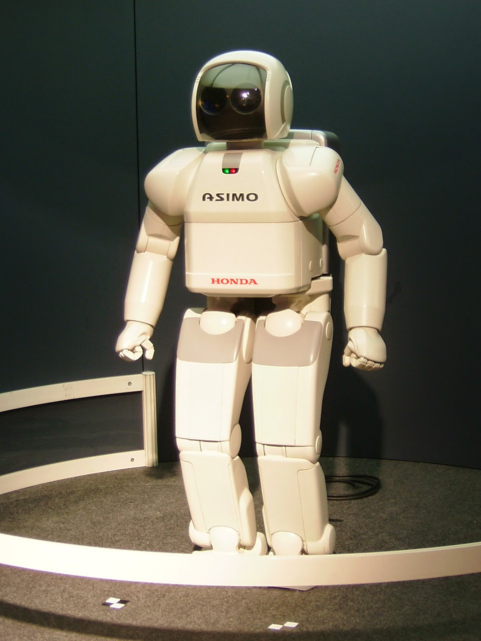
 
Asimo. Wiki commons.
 Today’s designs are simple line designs again, inspired mainly by the Japanese dog toys; the ones at the top of the page are fairly early tryouts against a yellow background with a nice gold glow.  Easy to draw freehand, pencil on paper but they look a bit rough on examination.  I am always looking for my clean line and so redrew them all digitally, giving them a nice blue finish.  I shall probably change that (remember CMYK colour doesn’t do blue very well) but it looks well in red, and green will work well too.  The actual dogs, like modern cars are invariably silver, but that won’t necessarily work as I’d have to do it grey.  They’ll all have glowing eyes though. 
Would you like this design on a t-shirt, mug, mousepad or bag?  Just click on the picture.
Asimo is completely white except for a black faceplate, and looks like a miniature NASA spacesuit with a mind of its own, and I suppose that one day they will actually put astronauts out of a job, or at least make them into desk bound remote viewers, pushing buttons on earth while the robot does the work in space.  But of course we should remember those seventies boffins who told us that robots don’t need to look human – they certainly won’t need to in space. 

And they said valve technology was dead!
My humanoid robot designs are similar in approach to the dog ones, and look a bit like Asimo, while I was researching pictures, I found an image of a very similar robot playing the trumpet, but I did mine long before I saw it.  Honest.  And even as I write another robotics laboratory in Japan is designing another robot dog.  They really want them – really.

My Zazzle site

The Implounge. 

Saturday, 21 March 2015

What colour is a crocodile?

 
Sobek, looking very RGB.
  So – what colour is a crocodile?  You know what a crocodile is don’t you?  A crocodile – sort of slung low to the ground, crawling on four legs –tail dragging behind.  Long snouty head, jaw full of teeth – twist you in half in a second.  That crocodile. 

If I asked what colour it is, you would probably say, a kind of dirty brown.  I’d agree, there may be a number of colours that make up that dirty brown (remember when you were a little kid in class, you mixed all the colours in the paint box together to see what colour they would make?  Brown – what a disappointment,) but generally its an olive greenish brown.

Go to child’s storybook though, and invariably a crocodile will be green.  In fact, all lizards and amphibians will be green regardless of whether they are or not.  It’s a convention of such material, probably to make sure the book is bright and cheerful for children, but also because it’s easier and cheaper to print one solid primary colour.And that brings me to the problems of print.  I can’t say I know much about this as I was never trained in graphic art and therefore never learnt much about how print works.  But I know that printers will print your art using the CMYK colour process, which stands for Cyan, Magenta, Yellow and Key – Key being black.

 
Example of colour shift on green crocodile.  With hands!

What it means is that digitally you want to create your work in colours that most closely approximate the real world, or at least which look bright and clean – pleasing to the eye, and so use the digital RGB (Red, Blue Green) to produce your image.  This is fine if you just want it to stay on a computer screen, (although there’s often a certain discrepancy in the way different screens handle colours) but if it’s going to be printed anywhere you’re probably going to have to deal with colour shift.

I’ve not really thought about this much and I think it’s about time I started.  For all those bright clean colours I like will become a little bit duller when printed in CMYK.  So that crocodile in the children’s book you just produced will be a darker green than you want.  Ironically it will be a tiny little bit closer to the way crocodiles actually look.  Does that mean CMYK is a good thing after all?With a certain amount of experiment I’ve come to realise that I can live with most of the colour shift that will result from a conversion between RGB and CMYK.  The reddish orange and yellows look okay, and dark reds still work pretty well.  The bright greens darken a little, but are still acceptable.  The one colour that is really effected by CMYK conversion is blue.


And that’s a shame, as I always liked a nice strong sapphire blue.  When this is converted from RGB to CMYK the brightness disappears and you are left with a kind of bluish slate grey.  It actually doesn’t look that bad, when with the right combination of other colours, it just means you have to be aware of the fact of the change and design accordingly.


But, for instance, this design of Bast in black with a blue outline would mean that the outline now almost disappears because it’s gone so dark.  I’ve spent a little time re-colouring some of my designs because of this problem, concentrating on the red yellow side of things because I think there’s less shift.

RGB above, CMYK below. 
In this example above, the comparison shows RGB on the top, CMYK on the bottom, and its obvious the reddish colours hardly seem to be effected at all.  At the left the red outline still looks the same although Anubis’s green vase has dulled a little.  The lettering has gone that slate grey I mentioned but the yellow has been unaffected.  On the right, I must admit the bright sapphire blue I chose doesn’t go with that type of orange, it causes the blue to almost fluoresce.  The darkening of the blue caused by the conversion to CMYK has actually improved it slightly, and I think I would have darkened that blue anyway.  So, the design on my screen looks like the top images, and what you get when its printed are the bottom images.

In most respects the conversion doesn’t cause too much harm, I will just have to remember even though it makes me a little blue – no more blue.


Saturday, 7 March 2015

Gods and Monsters: Developing an idea part 2


Flickr creative commons - by Mike Walker. https://www.flickr.com/photos/mikewalker82/
Imagine that you’re an ancient Egyptian, you really believe in the gods of old Egypt, and sadly you’re close to death.  The doctors have done all that is humanly possible for the time, and they’ve now consigned you to the priests so that they can give you the benefit of the correct rites, prayers and spells that will send you successfully on your way into the after life.

You’re drifting off, fading away from this world, and the world of the next life is visible in the hazy distance.  Only a little more journeying and that glorious paradise will be yours.  But then who should come galumphing over the horizon towards you but a big pointy-eared snouty-faced individual carrying a pair of scales.  Yes its Anubis, quite probably the most unpopular god you would ever wish to meet.

Anubis detail
And he’s here to weigh your heart against the truth.  The truth is symbolised by an ostrich feather.  Hearts (or souls for that’s what the heart represents) that weighed heavier than a feather were not worthy to go into the after life, and were instantly devoured by Ammit, a goddess spectacularly made from parts of a lion, a hippopotamus and a crocodile.  Of course you could always flash your ‘Pharaoh’s Express’ card at Anubis as a means of ensuring a place in the afterlife.  ‘That’ll do nicely sir’.

It must have been hard to like Anubis, especially if you’d been up to no good.  Hopefully my manic desire to depict him among other Egyptian gods for my Zazzle store won’t be deemed unworthy.  Last week I discussed the designs I did for the goddess Bast, a cat shaped divinity with protective powers, and this week I’ll discuss designs for Anubis.

I started sketches for these designs all together, trying out different characters and styles, and before I found the minimalist black fill blue outline look that I liked, I was open to a lot of different approaches.  Were the characters ‘cute’ or ‘cool’?  Here are a few of the scribbles I tried out to see what I needed. 
 
Cute, and  - not so cute.
 As you can see, it’s possible to vary the approach a great deal.  I dabbled with cute for a while, using a fennec fox as a model for the attempt on the left.  These little desert foxes have the big ears and tiny bodies that really are cute (though they’re quite ruthless predators) but they’re certainly not jackals or African dogs.  So I used those critters for the image on the left, still a cartoon, but with more truth about it.  After all, the early Egyptians originally chose the jackal as a god of the dead because they noted the prevalence of Jackals around gravesites.  The typical shallow graves of the period were an attraction to the animals that had no problem in disinterring corpses for food.  Maybe cuteness doesn’t fit.

Anubis needs that long dog snout, and his ribs showing.  He needs those glowing beady eyes and rough dust encrusted hide.  However I did want the designs to match, to fit together as a group so they all needed the same figure and stance, the same body.  The rough cartoon look of these scribbles doesn’t match with a clean line effect.

Those beady little eyes...
Some years ago I had tried to depict Anubis in a very slick minimalist style, less cartoon and with an emphasis on a glossy polished look, as if he were made from some highly polished dark stone or glass.   Here’s a detail.  It was okay, but I wasn’t happy at the time and didn’t completely finish it. 

Anubis detail

So I knew that the flat approach with no shading or paint effects and few lines was the way to go.  Head turned to the side, but what to do with the arms and hands?  Well, there's those scales I mentioned earlier, one in each hand.

So the finished article looks like this.
 
Anubis.  'Well, your heart goes in this one and...'

But I can take this all a few steps further by using the same approach to drawing the characters but using different positioning and colour work and getting a new and fresh result.


Saturday, 28 February 2015

Gods and Monsters: Developing an idea.


The world is split between dog and cat lovers.  I swing more in the cat direction myself, but only because they are mostly silent.  (I can’t stand all that barking!)  I accept that they are pretty self reliant, sometimes aloof and at times have some revolting habits, such as yakking up on the floor without warning and filling the litter tray just as you’re sitting down to eat.  But they are beautiful, and in the words of the great Flann O Brian, ‘...they have a lot of life in them when they are but juveniles’.

The ancient Egyptians knew this, their goddess Bast was depicted as a cat, and because of this the cat was sacred.  They made countless little statues of these cats, all symbolic of the goddess, and even mummified cats by the hundreds of thousands.

So, the start of an idea.  Lets follow it along its thread.  In 1922 Howard Carter and Lord Carnarvon discovered the tomb of King Tutankhamen and sparked a craze for all things ancient Egyptian.  And the style now know as Art Deco was also beginning to become very popular.

Howard Carter.  Public domain.
Now the thing with Art Deco is that it takes from everywhere and from every time.  If you look you’ll see influences from ancient Greece, China, Japan, India, Africa, from Russia the Aztecs, Assyrians and of course, very strongly from ancient Egypt.  That was Carter and Carnarvon’s unwitting and inadvertent contribution to Deco.

Art Deco therefore has a strong affinity with ancient Egypt.  And I’ve always liked Art Deco.  As a designer I felt I could put something together around the gods of Egypt that would be attractive, and which I could design in an Art Deco style.

I like a clean and spare approach, good strong lines and solid colour, and I wanted to reflect the actual Egyptian cat figurines which are small and usually a dark bronze or stone.  I chose black for the colour fill and a blue and gold for the lines.  But first I needed the image itself.

Here are some of the early working drawings (scribbles really) for my Bast design, and instead of showing Bast as just a cat; I thought she should have something of a human figure, especially with hands.  (Just think of the mischief most cats could accomplish if they had hands!)  I knew a real deco designer would go to town on the exotic eye make up, so that was an obvious area to accentuate. Some of the work behind a design of a figure is the posture that it will hold, what to do with the arms, what direction will the head face?  

Bast sketches.  Already looking for mischief.
All these things have an effect on the finished whole, and it can take more time than you might think to work this out and get a pleasing result at the end.  The Egyptian manner of depicting characters is more than the sideways walk-like-an-Egyptian style, its also to do with the angular position of arms and hands and heads usually seen in worship or mourning scenes.  I want to reflect a little of that as I go along. 

So Bast's hands could be together as if preying, her arms could be crossed over her body as we have seen in some mummies, her arms or hands might be moving to the left, while her head turns to the right.  This is part and parcel of the method of suggesting life and movement in drawn figures.


Working on body posture
Then as always you polish the design, work on the outline, because this particular image will practically be a silhouette and so it has to work as one.  When I first began, I didn't intend to give the figure a blue outline.  I tried combinations of black outline and dark blue grey, but I found the outline disappearing and the whole began to lose its strength.  I think I decided on blue by accident while I was trying to do the blue eye makeup.  It wasn't my natural choice, and I wasn't  sure for a while, but I saw over time that it was the only way it would work.


Bast detail.
There had to be a strong colour between the black and white to give it the extra lift.  Black and white work together well as generations of artists will tell you, but as I wanted the features that exist amongst the solid colour to be outlined, I felt they looked better when connected to a unifying outer line.   And I decided the eyes were more impressive if they were round like a real cats eyes appear, than with the traditional 'Egyptian eye' that I used in the above sketches.

So here's the finished thing. Some might object to the way I have depicted her, as most people think of cats as slinky thin little things, but some cats have a pleasant sturdiness about them that I wanted to express.  Some of them have stumpy little legs, and chunky bodies, but somehow are none the less attractive for it.


Finished Bast design.
I will continue this blog next week with some thoughts on my Image of the God Anubis.