Showing posts with label Egypt. Show all posts

Saturday, 27 June 2015

Flight ready


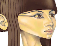
I swore the arms would be done this week, and they are, just about.  All flight systems are on line and she's taxiing on to the runway - well, hopping would probably be a better description.  Hopping because she has legs and feet, as well as arms.  And as you can see from the picture at the top of the page, she has eyes as well.

As usual I began the arms on a separate layer, which was just as well as I've had to cut them up, and rotate them, and bits of them, and move them slightly back and forth over the shoulder region trying to decide what looked right.  And rub out parts of them and redraw and repaint gaps, and cut areas and generally curse and swear.  Was it worth it?  Hmmm, that's debatable.

As I said last week, I decided to have her holding a box instead of a scroll, because I thought that a scroll of the type I envisaged would be awkward and would obscure parts of the arms and chest of the bird.  And you have to be able to see that she's a bird with arms.  Both arms would also have to be pretty extended so I could show that she was unrolling a large scroll.  My sketches weren't promising.

Arms above the basic lines.  Note the gap at the right elbow where I cut it and rotated the forearm.
Above you can see the underlying lines with the arms placed over them.  They don't look right of course, and I've had to pay attention to the left arm, shortening it at the elbow and darkening it for shadow.  But the arms aren't to my liking.  I mess about with the shape of them, redrawing and colouring but I don't really improve them.  They look like a dolls arms, and even though this is an arch fantasy subject it should still look as real as that allows.

Seeing the arms with the rest of the colour layers.  Still no hands.
The box is now in place as well, and its position has migrated around the image by millimetres while I tried to finalise the arms placement.  I've also darkened the feathers just under the arms.  Then began to apply myself to the tricky problem of hands.  I didn't want to spend forever on the web looking for references, as that task can be endless.  You always think that if you look a bit harder you'll find the perfect image, and end up with masses, only to find when trying to use them that they don't really match with what you intended anyway.  But that means trying to 'busk' your way through it.

First hand in, and look at that box - it's slipped down the layer tree so its now under the hair!  I'll have to drag it up again.
Well, the first hand is in, and I'm not overwhelmed by the result, but soldier on anyway.  I manage to make a slightly better hand for the other arm that covers the box, but neither is brilliant.

The finished arms.  That box is a bit plain, it could do with some hieroglyphics or something.
And the legs, which I haven't really shown much of, are finished with scales toes and claws, and it's about this stage that I begin (in fact quite a while ago) to see how funny the thing is.  And that's the genius of those Egyptian painters that they could with a brush and some papyrus quickly and deftly depict this strange being and make it cool and attractive but not funny. 


The finished Ba bird - with added shadow.  Hah ha - sparrowlegs!
  And that's a lesson about approach and style more than anything else; those ancient artists needed images for a single well - defined purpose, to depict a mystic being in the papyruses of the Book of the Dead.  They needed to be quick, clean and easily identifiable.  They had the advantage of having to conform to a particular style, the flat side - on look of the Egyptians, and the images were small, so much so in fact that it's often difficult to see if it's male or female.  Simple, quick, clean.

So there it is.  The trouble with too many Ba birds is that the feathers get up your nose.  Something else for next week I think. 

My website

My Zazzle Page

Saturday, 20 June 2015

A head turner


Continuing the saga of the Ba bird, and I know that I promised arms last week, but a second thought is never a bad one.  Although I was quite happy with the colouring last week, I am still disappointed with the fairly dull manner with which the subject is presented.  Why didn't I do something with the wings?  Why is it so static?  But these are pretty familiar questions any artist will ask themselves, even when the work is actually better than they think.

However, I fear that this is worse than I think!  How to pep it up a bit?  What options might there be?  Well, changing the direction of the head is a good start.  We find it more pleasing when a figure is shown in full, if the head is turned in the opposite direction to that of the body.  This will apply even with a head to waist image.  It gives the body the illusion of motion and therefore life, and so adds more interest to a drawing or painting.  But we've got this far, is it worth turning back.  I think so, because you start a piece of work with a vision in your head of what you'd like it to be, and you have to struggle towards that.  If it means starting again or getting rid of a portion of the work then do it, because you almost certainly will do it better next time.  You've already gone through it once - look at the practice you've had!

The terrible deed is done - I sliced off her head and stuck it back on - brutal!
But I'll concede, starting again can be tricky, especially if you're painting on paper of canvas.  With this digital image there are certain things that make it easier.  She's floating on a layer, so I can cut her head off and flip it over.  Obviously there are some instances where this doesn't work, if the head is in an awkward position  for a reversal, but if its possible it's an easy thing to do.  Then you have the work of joining it all together again - that's what's putting you off isn't it?

In this case it's just a matter of hard slog, restructuring the neck to take account of the great tendon that shows when someone turns their neck (especially skinny people), the windpipe and the slight dip in the neck just above the collar bones.  Getting rid of the hair is easy enough, digitally sample the flesh colours near the gaps and begin to repaint. 

It looks a mess, but its all under control - no really - it is.
Then begin again on the feathers of the breast, so that they gradually blend into the skin.  Those pesky arms have got to fit onto the main torso as well, so whatever I do has to keep them in mind.  The fall of hair now on the left of the picture no longer has to move forward to go over the shoulder, and can hang straight, so this has to be corrected.

The neck now re-painted, with a few minor readjustments to the hair.
Now I'm forced to give some serious thought about the arms, because a. I need to know where I'm going to attach them to a structure pretty alien to human anatomy and b. because I'm a little worried about them, as my experiments along those lines haven't worked out very well.  The shoulders are the important starting points, where they are will dictate how the rest of the arms will look, so placing them in a convincing position is the next stage.
Just started to place the shoulders.
With this last picture you can see how I've approached that, and now hope to slowly build the arms up from this.  I originally said I would have her holding a manuscript - that's changed to a box.  So next week some arms, and maybe some eyes.

Visit my Zazzle store 

My Website

Saturday, 13 June 2015

Called back to the Ba


This week we continue the struggle to make something coherent from this Ba bird idea, and - I've changed my mind pretty comprehensively on how it should look.  I decided at the end of the last blog that the original is too big, the body too elongated, and that it must conform more to the proportions of a bird.  I said that I would base the bird body on that of an Egyptian wagtail, but now I've begun to doubt that choice.

There are all kinds of needless things that you can worry about with this sort of thing, and one of the worries I continually trouble myself with is ' is it authentic, is it accurate?'  In fact it doesn't matter at all, but now I began to ask, 'what kind of bird was it that the Egyptians really used?'

I think I mentioned last week that they used a variety of birds such as stalks and falcons, but I now found myself going back onto the internet to search through all the Egyptian images of the Ba bird available.  And the answer is that mostly they seem to be hawks - falcons in fact.  Some depict a very long legged bird that I took to be an Ibis, but the colour the Egyptians show the bird seems darker than that of the actual bird.  It might of course be one of those birds that change their plumage at different times of the year - and there you are, a little knowledge is a dangerous thing.

The basic shape of your basic Ba bird.
So I have gone back to the Egyptian work and trust the original source.  They worked out how to make this crazy idea make some visual sense and so I now accept that my Ba bird will have the appearance of a falcon, and I dutifully sourced some good photos of falcons that showed me not only the size and proportions but also the feather formation. But another problem is looming on the horizon, the arms.  I can see they're going to be awkward because of where they emerge from the body of the bird, but they are an important part of this characters appearance.

That struggle is yet to come however, as next I'll concentrate on the wings, using a reference as a guide for the size and shape of the feathers that change in size as they go down a bird's wing.  The wings of the peregrine  falcon are a bluish grey with soft almost metallic effect light grey edges to each feather so blending and softening the hard edges of the lines I use is important.
 
Starting the task of placing in the feathers.

 The feathers have almost a tessellated look to them which is important to get right at the start, so that the pattern can continue correctly.  Another minor problem is understanding how the wings of the bird fold together, but artists are past masters at faking this kind of thing, and if there's something they don't understand they put it in shadow or blend it into something near, but only when they judge that they can get away with it.

Most of the feathers in, and some of the black marks on the breast and legs.
It's in the blessed knowledge of my fellow human's ignorance that I can fake the way the wings actually come together at the end of the tail, and be happy with the percentage of bird mad experts who will spot the discrepancies right away.  And now I can start on the peculiar patterns the falcon has on its chest and legs, strange cross like striations of black that cover all the light parts.
The subject through it's different stages.  Click on the image to see it slightly bigger.
The downright 'oddness' of this subject is not lost on me, in fact it's one of the things that drew me to it but putting the elements of bird and human together in a more realistic way then any ancient Egyptian would have done has thrown up a lot of problems.  The slow progress has even underlined for me what a dull image I've made of it, without even a turn of the head in a dramatic posture to relieve the boredom.  I could have chosen something more dynamic to do with the wings for instance.   But you begin with an 'interior' vision of what you want and work towards it, and sometimes you become fixated on an idea without re-evaluating enough.

Next week - those dreaded arms!

See my website

See my Zazzle store

Saturday, 6 June 2015

Called to the Ba.


No, that isn't a typo in the title smarty-pants;  it refers to a type of exotic and mythical creature, part of ancient Egyptian religious beliefs.  I mentioned the Ba bird a few blogs ago, and stated that I'd like to have a go at illustrating it.  You may know, or remember from the last blog that the Ba was one of three spiritual entities believed by the Egyptians to inhabit the tomb of a deceased person after the tomb was sealed.

The Ba represented the character of the deceased, the thing that made them who they were.  Oh and did I mention that they're birds with human heads and arms, so, ideal for the average bird watchers notepad.  Ba's could travel around in the real world in any shape if they needed to, possibly putting right the misdeeds of the dead person, or seeing to last minute problems. (was that life insurance policy up to date?)  But they had to return to the tomb to witness the weighing of their masters soul before re-entering the body of the deceased.  A workload like that would ruffle anybodies feathers.

As usual with this digital illustration thing, I start to draw on a layer with a slate grey line as large as I want because I will shrink the drawing down, as I need more room.  This time round I decided to use a layer for a very rough sketch and brought the opacity down to three of four percent so the lines were barely visible.  I then put another layer above and drew the actual lines on this.  It helps you judge better where you really want the lines and the faint lines don't detract from a change of mind.
Beginning of the drawing with paint additions
I began with the head, as most artists do, and if it's a full face I start my line almost always at the point where the bridge of the nose slides into the furthest eye socket.  It's a good point to start, because its very easy to then judge where the tip of the nose and nostril should be, and from that you can then easily judge how much of the furthest side of the face should be visible.  Easier said than done I hear you say?  Well, maybe, it all depends how far down the road you are.  

Close up of the paint, showing the way shadows are placed.

  I probably show all the traits of lack of patience, as I want to start painting at once, and so begin to apply a yellowish base colour onto the same layer as the drawing.  I place in a slightly darker yellow for the first indications of shadows, and a yellowish grey for darker shadows, at all times avoiding true black.  The hair or wig will be a very dark reddish brown.  I use a grey brown and work it around the eyes, covering the eyelids, and fill in the spaces where the eyes will be with the yellow of the skin.

Grey shadows defining the nose, neck and eyes.  The spaces of the eyes are also filled with yellow.
The dark wig will have long trailing pieces hanging down each shoulder, across which the arms will cut.  I have placed a little light on the face, on the nose and cheekbone and around the mouth, but I'm keeping it low for the time being.  Here I have to admit that I'm not sure how the whole picture will look.  This is the basis of many of my failures over the years; I have a vague idea of what I want, but then try to make it up as I go.  However gradually I am getting a clearer idea, I want an image of the full Ba bird, holding a scroll of papyrus, as if showing it to the viewer.
Faint grey lines used to work out positioning of the arms and scroll.

This means showing the whole bird body, with its tail feathers and long legs.  I wondered at this stage how the Egyptians themselves depicted the particular birds they used in their drawings and sculptures of the Ba.  Were they one definite bird, and was that bird still around, or had it gone extinct, as I believe some of the animals of ancient Egypt have?   I was curious, as I wanted a guide for the feathers of the bird.  The Egyptians seemed to depict the birds in many different ways, sometimes as hawks, sometimes as stalks or cranes.  I looked online and found a common Egyptian bird that I liked and which seemed to resemble some of the ancient depictions - a yellow wagtail.  I'm less worried that this isn't authentic than I'm happy to have something to use as a reference. 

But I now see something more worrying than a bad choice of Egyptian bird.  The figure is becoming unbalanced, too elongated.  I need to concentrate on making the body smaller.  To make this work the bird should have a big head and a petite little bird body, with quite long legs and arms.  It's going wrong, but when that happens you have to fight it until it goes right.

Lets see what we have next week.

See my Zazzle page.

See my Website

Saturday, 2 May 2015

Sphinx


I’ve mentioned before that I really like Art Deco, appreciating its cosmopolitan ways, in taking from anywhere and everywhere – and everywhen.  It has taken elements from all cultures and all time periods and blended them together, usually in to a highly successful whole. 

Ancient Greece was an obvious target for Art Deco artists to re-use and the sphinx, a mythical creature common to Greece and Egypt easily attracted their interest.  Deco was influenced by Egypt as well, so they had no shortage of sphinxes to choose from.  I’m going to tackle a Greek style sphinx, as might have been imagined in the thirties. 

 Almost all materials were used by Deco artists, as it was an arts and crafts movement, so when I began to design and develop a digital image in the style I chose to make it look like a polished steel or aluminium sculpture in repousse or hammered metal style. 

I imagined a kind of plaque like decorative sculpture of the type found commonly in decorative material for buildings and interior spaces in the twenties and thirties.  You can also see these sorts of design in Deco glass and stoneware.  They’re often attached to buildings over doors or windows, or pressed into glass partition panels, and this is a long-term form for the decorative arts.  Only Deco seems to have done a great deal of this kind of thing with metal.
 
Beginning the drawing.
  I started with a drawing of the face and head, because I wanted it to look right for a Deco design, with the hair that might have been seen in the thirties (where a sphinx gets her hair done is anybodies guess – but they must be one hell of a hairdressers,) and the rest of the design – as always grows out from this. 

 I knew the hair was going to give me trouble.  It always does.  Designing flowing hair, or draperies for that matter is always difficult, and you’re almost never happy with it.  I rubbed out the hair several times because it looked lame, concentrating less on spiral like shapes and more on flowing locks of hair.  I’m a little concerned that the hair will look separate from the rest of the design, too intricate, with nothing to balance it.  

The overall design was going to be a squareish form, so that all the elements of the figure fitted into a block.  This would make the figure seem squat but this is a form that Deco often experimented with for its figures.  So for instance, the outer line of the face follows the same line as the outer edge of the body. 
 
Progress on the hair.
  The wings are next, naturally forming from the rest of the work, as if the upper part of the design has to be finished first.  I find it interesting to see what parts of an image naturally form first, and why we always find ourselves progressing to very particular parts of a design, always finishing them first before moving on; and of course, everything has to fit into that box I’ve set myself to work in.  
 
The wings form.
 The wings are work intensive, just getting the curves correct is a little difficult and they have to look a particular way.  I suppose its derived from not only classical sculptures, but medieval and Neo Classical ideas.  Sculptures of everything from sphinxes to griffins to angels have almost a set of rules for wings.  I won’t say I know those rules, but I’m trying to conform to that look in hopes I’m doing something right.  I can’t help putting a little colour (if tones of grey can be termed colour) on to the image, even without it being finished – just to see.  Next week I’ll say something about the completion.


Saturday, 7 March 2015

Gods and Monsters: Developing an idea part 2


Flickr creative commons - by Mike Walker. https://www.flickr.com/photos/mikewalker82/
Imagine that you’re an ancient Egyptian, you really believe in the gods of old Egypt, and sadly you’re close to death.  The doctors have done all that is humanly possible for the time, and they’ve now consigned you to the priests so that they can give you the benefit of the correct rites, prayers and spells that will send you successfully on your way into the after life.

You’re drifting off, fading away from this world, and the world of the next life is visible in the hazy distance.  Only a little more journeying and that glorious paradise will be yours.  But then who should come galumphing over the horizon towards you but a big pointy-eared snouty-faced individual carrying a pair of scales.  Yes its Anubis, quite probably the most unpopular god you would ever wish to meet.

Anubis detail
And he’s here to weigh your heart against the truth.  The truth is symbolised by an ostrich feather.  Hearts (or souls for that’s what the heart represents) that weighed heavier than a feather were not worthy to go into the after life, and were instantly devoured by Ammit, a goddess spectacularly made from parts of a lion, a hippopotamus and a crocodile.  Of course you could always flash your ‘Pharaoh’s Express’ card at Anubis as a means of ensuring a place in the afterlife.  ‘That’ll do nicely sir’.

It must have been hard to like Anubis, especially if you’d been up to no good.  Hopefully my manic desire to depict him among other Egyptian gods for my Zazzle store won’t be deemed unworthy.  Last week I discussed the designs I did for the goddess Bast, a cat shaped divinity with protective powers, and this week I’ll discuss designs for Anubis.

I started sketches for these designs all together, trying out different characters and styles, and before I found the minimalist black fill blue outline look that I liked, I was open to a lot of different approaches.  Were the characters ‘cute’ or ‘cool’?  Here are a few of the scribbles I tried out to see what I needed. 
 
Cute, and  - not so cute.
 As you can see, it’s possible to vary the approach a great deal.  I dabbled with cute for a while, using a fennec fox as a model for the attempt on the left.  These little desert foxes have the big ears and tiny bodies that really are cute (though they’re quite ruthless predators) but they’re certainly not jackals or African dogs.  So I used those critters for the image on the left, still a cartoon, but with more truth about it.  After all, the early Egyptians originally chose the jackal as a god of the dead because they noted the prevalence of Jackals around gravesites.  The typical shallow graves of the period were an attraction to the animals that had no problem in disinterring corpses for food.  Maybe cuteness doesn’t fit.

Anubis needs that long dog snout, and his ribs showing.  He needs those glowing beady eyes and rough dust encrusted hide.  However I did want the designs to match, to fit together as a group so they all needed the same figure and stance, the same body.  The rough cartoon look of these scribbles doesn’t match with a clean line effect.

Those beady little eyes...
Some years ago I had tried to depict Anubis in a very slick minimalist style, less cartoon and with an emphasis on a glossy polished look, as if he were made from some highly polished dark stone or glass.   Here’s a detail.  It was okay, but I wasn’t happy at the time and didn’t completely finish it. 

Anubis detail

So I knew that the flat approach with no shading or paint effects and few lines was the way to go.  Head turned to the side, but what to do with the arms and hands?  Well, there's those scales I mentioned earlier, one in each hand.

So the finished article looks like this.
 
Anubis.  'Well, your heart goes in this one and...'

But I can take this all a few steps further by using the same approach to drawing the characters but using different positioning and colour work and getting a new and fresh result.


Saturday, 28 February 2015

Gods and Monsters: Developing an idea.


The world is split between dog and cat lovers.  I swing more in the cat direction myself, but only because they are mostly silent.  (I can’t stand all that barking!)  I accept that they are pretty self reliant, sometimes aloof and at times have some revolting habits, such as yakking up on the floor without warning and filling the litter tray just as you’re sitting down to eat.  But they are beautiful, and in the words of the great Flann O Brian, ‘...they have a lot of life in them when they are but juveniles’.

The ancient Egyptians knew this, their goddess Bast was depicted as a cat, and because of this the cat was sacred.  They made countless little statues of these cats, all symbolic of the goddess, and even mummified cats by the hundreds of thousands.

So, the start of an idea.  Lets follow it along its thread.  In 1922 Howard Carter and Lord Carnarvon discovered the tomb of King Tutankhamen and sparked a craze for all things ancient Egyptian.  And the style now know as Art Deco was also beginning to become very popular.

Howard Carter.  Public domain.
Now the thing with Art Deco is that it takes from everywhere and from every time.  If you look you’ll see influences from ancient Greece, China, Japan, India, Africa, from Russia the Aztecs, Assyrians and of course, very strongly from ancient Egypt.  That was Carter and Carnarvon’s unwitting and inadvertent contribution to Deco.

Art Deco therefore has a strong affinity with ancient Egypt.  And I’ve always liked Art Deco.  As a designer I felt I could put something together around the gods of Egypt that would be attractive, and which I could design in an Art Deco style.

I like a clean and spare approach, good strong lines and solid colour, and I wanted to reflect the actual Egyptian cat figurines which are small and usually a dark bronze or stone.  I chose black for the colour fill and a blue and gold for the lines.  But first I needed the image itself.

Here are some of the early working drawings (scribbles really) for my Bast design, and instead of showing Bast as just a cat; I thought she should have something of a human figure, especially with hands.  (Just think of the mischief most cats could accomplish if they had hands!)  I knew a real deco designer would go to town on the exotic eye make up, so that was an obvious area to accentuate. Some of the work behind a design of a figure is the posture that it will hold, what to do with the arms, what direction will the head face?  

Bast sketches.  Already looking for mischief.
All these things have an effect on the finished whole, and it can take more time than you might think to work this out and get a pleasing result at the end.  The Egyptian manner of depicting characters is more than the sideways walk-like-an-Egyptian style, its also to do with the angular position of arms and hands and heads usually seen in worship or mourning scenes.  I want to reflect a little of that as I go along. 

So Bast's hands could be together as if preying, her arms could be crossed over her body as we have seen in some mummies, her arms or hands might be moving to the left, while her head turns to the right.  This is part and parcel of the method of suggesting life and movement in drawn figures.


Working on body posture
Then as always you polish the design, work on the outline, because this particular image will practically be a silhouette and so it has to work as one.  When I first began, I didn't intend to give the figure a blue outline.  I tried combinations of black outline and dark blue grey, but I found the outline disappearing and the whole began to lose its strength.  I think I decided on blue by accident while I was trying to do the blue eye makeup.  It wasn't my natural choice, and I wasn't  sure for a while, but I saw over time that it was the only way it would work.


Bast detail.
There had to be a strong colour between the black and white to give it the extra lift.  Black and white work together well as generations of artists will tell you, but as I wanted the features that exist amongst the solid colour to be outlined, I felt they looked better when connected to a unifying outer line.   And I decided the eyes were more impressive if they were round like a real cats eyes appear, than with the traditional 'Egyptian eye' that I used in the above sketches.

So here's the finished thing. Some might object to the way I have depicted her, as most people think of cats as slinky thin little things, but some cats have a pleasant sturdiness about them that I wanted to express.  Some of them have stumpy little legs, and chunky bodies, but somehow are none the less attractive for it.


Finished Bast design.
I will continue this blog next week with some thoughts on my Image of the God Anubis.