Showing posts with label "Ancient Egypt". Show all posts

Saturday, 27 June 2015

Flight ready


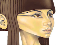
I swore the arms would be done this week, and they are, just about.  All flight systems are on line and she's taxiing on to the runway - well, hopping would probably be a better description.  Hopping because she has legs and feet, as well as arms.  And as you can see from the picture at the top of the page, she has eyes as well.

As usual I began the arms on a separate layer, which was just as well as I've had to cut them up, and rotate them, and bits of them, and move them slightly back and forth over the shoulder region trying to decide what looked right.  And rub out parts of them and redraw and repaint gaps, and cut areas and generally curse and swear.  Was it worth it?  Hmmm, that's debatable.

As I said last week, I decided to have her holding a box instead of a scroll, because I thought that a scroll of the type I envisaged would be awkward and would obscure parts of the arms and chest of the bird.  And you have to be able to see that she's a bird with arms.  Both arms would also have to be pretty extended so I could show that she was unrolling a large scroll.  My sketches weren't promising.

Arms above the basic lines.  Note the gap at the right elbow where I cut it and rotated the forearm.
Above you can see the underlying lines with the arms placed over them.  They don't look right of course, and I've had to pay attention to the left arm, shortening it at the elbow and darkening it for shadow.  But the arms aren't to my liking.  I mess about with the shape of them, redrawing and colouring but I don't really improve them.  They look like a dolls arms, and even though this is an arch fantasy subject it should still look as real as that allows.

Seeing the arms with the rest of the colour layers.  Still no hands.
The box is now in place as well, and its position has migrated around the image by millimetres while I tried to finalise the arms placement.  I've also darkened the feathers just under the arms.  Then began to apply myself to the tricky problem of hands.  I didn't want to spend forever on the web looking for references, as that task can be endless.  You always think that if you look a bit harder you'll find the perfect image, and end up with masses, only to find when trying to use them that they don't really match with what you intended anyway.  But that means trying to 'busk' your way through it.

First hand in, and look at that box - it's slipped down the layer tree so its now under the hair!  I'll have to drag it up again.
Well, the first hand is in, and I'm not overwhelmed by the result, but soldier on anyway.  I manage to make a slightly better hand for the other arm that covers the box, but neither is brilliant.

The finished arms.  That box is a bit plain, it could do with some hieroglyphics or something.
And the legs, which I haven't really shown much of, are finished with scales toes and claws, and it's about this stage that I begin (in fact quite a while ago) to see how funny the thing is.  And that's the genius of those Egyptian painters that they could with a brush and some papyrus quickly and deftly depict this strange being and make it cool and attractive but not funny. 


The finished Ba bird - with added shadow.  Hah ha - sparrowlegs!
  And that's a lesson about approach and style more than anything else; those ancient artists needed images for a single well - defined purpose, to depict a mystic being in the papyruses of the Book of the Dead.  They needed to be quick, clean and easily identifiable.  They had the advantage of having to conform to a particular style, the flat side - on look of the Egyptians, and the images were small, so much so in fact that it's often difficult to see if it's male or female.  Simple, quick, clean.

So there it is.  The trouble with too many Ba birds is that the feathers get up your nose.  Something else for next week I think. 

My website

My Zazzle Page

Saturday, 20 June 2015

A head turner


Continuing the saga of the Ba bird, and I know that I promised arms last week, but a second thought is never a bad one.  Although I was quite happy with the colouring last week, I am still disappointed with the fairly dull manner with which the subject is presented.  Why didn't I do something with the wings?  Why is it so static?  But these are pretty familiar questions any artist will ask themselves, even when the work is actually better than they think.

However, I fear that this is worse than I think!  How to pep it up a bit?  What options might there be?  Well, changing the direction of the head is a good start.  We find it more pleasing when a figure is shown in full, if the head is turned in the opposite direction to that of the body.  This will apply even with a head to waist image.  It gives the body the illusion of motion and therefore life, and so adds more interest to a drawing or painting.  But we've got this far, is it worth turning back.  I think so, because you start a piece of work with a vision in your head of what you'd like it to be, and you have to struggle towards that.  If it means starting again or getting rid of a portion of the work then do it, because you almost certainly will do it better next time.  You've already gone through it once - look at the practice you've had!

The terrible deed is done - I sliced off her head and stuck it back on - brutal!
But I'll concede, starting again can be tricky, especially if you're painting on paper of canvas.  With this digital image there are certain things that make it easier.  She's floating on a layer, so I can cut her head off and flip it over.  Obviously there are some instances where this doesn't work, if the head is in an awkward position  for a reversal, but if its possible it's an easy thing to do.  Then you have the work of joining it all together again - that's what's putting you off isn't it?

In this case it's just a matter of hard slog, restructuring the neck to take account of the great tendon that shows when someone turns their neck (especially skinny people), the windpipe and the slight dip in the neck just above the collar bones.  Getting rid of the hair is easy enough, digitally sample the flesh colours near the gaps and begin to repaint. 

It looks a mess, but its all under control - no really - it is.
Then begin again on the feathers of the breast, so that they gradually blend into the skin.  Those pesky arms have got to fit onto the main torso as well, so whatever I do has to keep them in mind.  The fall of hair now on the left of the picture no longer has to move forward to go over the shoulder, and can hang straight, so this has to be corrected.

The neck now re-painted, with a few minor readjustments to the hair.
Now I'm forced to give some serious thought about the arms, because a. I need to know where I'm going to attach them to a structure pretty alien to human anatomy and b. because I'm a little worried about them, as my experiments along those lines haven't worked out very well.  The shoulders are the important starting points, where they are will dictate how the rest of the arms will look, so placing them in a convincing position is the next stage.
Just started to place the shoulders.
With this last picture you can see how I've approached that, and now hope to slowly build the arms up from this.  I originally said I would have her holding a manuscript - that's changed to a box.  So next week some arms, and maybe some eyes.

Visit my Zazzle store 

My Website

Saturday, 13 June 2015

Called back to the Ba


This week we continue the struggle to make something coherent from this Ba bird idea, and - I've changed my mind pretty comprehensively on how it should look.  I decided at the end of the last blog that the original is too big, the body too elongated, and that it must conform more to the proportions of a bird.  I said that I would base the bird body on that of an Egyptian wagtail, but now I've begun to doubt that choice.

There are all kinds of needless things that you can worry about with this sort of thing, and one of the worries I continually trouble myself with is ' is it authentic, is it accurate?'  In fact it doesn't matter at all, but now I began to ask, 'what kind of bird was it that the Egyptians really used?'

I think I mentioned last week that they used a variety of birds such as stalks and falcons, but I now found myself going back onto the internet to search through all the Egyptian images of the Ba bird available.  And the answer is that mostly they seem to be hawks - falcons in fact.  Some depict a very long legged bird that I took to be an Ibis, but the colour the Egyptians show the bird seems darker than that of the actual bird.  It might of course be one of those birds that change their plumage at different times of the year - and there you are, a little knowledge is a dangerous thing.

The basic shape of your basic Ba bird.
So I have gone back to the Egyptian work and trust the original source.  They worked out how to make this crazy idea make some visual sense and so I now accept that my Ba bird will have the appearance of a falcon, and I dutifully sourced some good photos of falcons that showed me not only the size and proportions but also the feather formation. But another problem is looming on the horizon, the arms.  I can see they're going to be awkward because of where they emerge from the body of the bird, but they are an important part of this characters appearance.

That struggle is yet to come however, as next I'll concentrate on the wings, using a reference as a guide for the size and shape of the feathers that change in size as they go down a bird's wing.  The wings of the peregrine  falcon are a bluish grey with soft almost metallic effect light grey edges to each feather so blending and softening the hard edges of the lines I use is important.
 
Starting the task of placing in the feathers.

 The feathers have almost a tessellated look to them which is important to get right at the start, so that the pattern can continue correctly.  Another minor problem is understanding how the wings of the bird fold together, but artists are past masters at faking this kind of thing, and if there's something they don't understand they put it in shadow or blend it into something near, but only when they judge that they can get away with it.

Most of the feathers in, and some of the black marks on the breast and legs.
It's in the blessed knowledge of my fellow human's ignorance that I can fake the way the wings actually come together at the end of the tail, and be happy with the percentage of bird mad experts who will spot the discrepancies right away.  And now I can start on the peculiar patterns the falcon has on its chest and legs, strange cross like striations of black that cover all the light parts.
The subject through it's different stages.  Click on the image to see it slightly bigger.
The downright 'oddness' of this subject is not lost on me, in fact it's one of the things that drew me to it but putting the elements of bird and human together in a more realistic way then any ancient Egyptian would have done has thrown up a lot of problems.  The slow progress has even underlined for me what a dull image I've made of it, without even a turn of the head in a dramatic posture to relieve the boredom.  I could have chosen something more dynamic to do with the wings for instance.   But you begin with an 'interior' vision of what you want and work towards it, and sometimes you become fixated on an idea without re-evaluating enough.

Next week - those dreaded arms!

See my website

See my Zazzle store

Saturday, 6 June 2015

Called to the Ba.


No, that isn't a typo in the title smarty-pants;  it refers to a type of exotic and mythical creature, part of ancient Egyptian religious beliefs.  I mentioned the Ba bird a few blogs ago, and stated that I'd like to have a go at illustrating it.  You may know, or remember from the last blog that the Ba was one of three spiritual entities believed by the Egyptians to inhabit the tomb of a deceased person after the tomb was sealed.

The Ba represented the character of the deceased, the thing that made them who they were.  Oh and did I mention that they're birds with human heads and arms, so, ideal for the average bird watchers notepad.  Ba's could travel around in the real world in any shape if they needed to, possibly putting right the misdeeds of the dead person, or seeing to last minute problems. (was that life insurance policy up to date?)  But they had to return to the tomb to witness the weighing of their masters soul before re-entering the body of the deceased.  A workload like that would ruffle anybodies feathers.

As usual with this digital illustration thing, I start to draw on a layer with a slate grey line as large as I want because I will shrink the drawing down, as I need more room.  This time round I decided to use a layer for a very rough sketch and brought the opacity down to three of four percent so the lines were barely visible.  I then put another layer above and drew the actual lines on this.  It helps you judge better where you really want the lines and the faint lines don't detract from a change of mind.
Beginning of the drawing with paint additions
I began with the head, as most artists do, and if it's a full face I start my line almost always at the point where the bridge of the nose slides into the furthest eye socket.  It's a good point to start, because its very easy to then judge where the tip of the nose and nostril should be, and from that you can then easily judge how much of the furthest side of the face should be visible.  Easier said than done I hear you say?  Well, maybe, it all depends how far down the road you are.  

Close up of the paint, showing the way shadows are placed.

  I probably show all the traits of lack of patience, as I want to start painting at once, and so begin to apply a yellowish base colour onto the same layer as the drawing.  I place in a slightly darker yellow for the first indications of shadows, and a yellowish grey for darker shadows, at all times avoiding true black.  The hair or wig will be a very dark reddish brown.  I use a grey brown and work it around the eyes, covering the eyelids, and fill in the spaces where the eyes will be with the yellow of the skin.

Grey shadows defining the nose, neck and eyes.  The spaces of the eyes are also filled with yellow.
The dark wig will have long trailing pieces hanging down each shoulder, across which the arms will cut.  I have placed a little light on the face, on the nose and cheekbone and around the mouth, but I'm keeping it low for the time being.  Here I have to admit that I'm not sure how the whole picture will look.  This is the basis of many of my failures over the years; I have a vague idea of what I want, but then try to make it up as I go.  However gradually I am getting a clearer idea, I want an image of the full Ba bird, holding a scroll of papyrus, as if showing it to the viewer.
Faint grey lines used to work out positioning of the arms and scroll.

This means showing the whole bird body, with its tail feathers and long legs.  I wondered at this stage how the Egyptians themselves depicted the particular birds they used in their drawings and sculptures of the Ba.  Were they one definite bird, and was that bird still around, or had it gone extinct, as I believe some of the animals of ancient Egypt have?   I was curious, as I wanted a guide for the feathers of the bird.  The Egyptians seemed to depict the birds in many different ways, sometimes as hawks, sometimes as stalks or cranes.  I looked online and found a common Egyptian bird that I liked and which seemed to resemble some of the ancient depictions - a yellow wagtail.  I'm less worried that this isn't authentic than I'm happy to have something to use as a reference. 

But I now see something more worrying than a bad choice of Egyptian bird.  The figure is becoming unbalanced, too elongated.  I need to concentrate on making the body smaller.  To make this work the bird should have a big head and a petite little bird body, with quite long legs and arms.  It's going wrong, but when that happens you have to fight it until it goes right.

Lets see what we have next week.

See my Zazzle page.

See my Website

Saturday, 23 May 2015

Drawing the Lions of Nectanebo

This business of drawing, I've pretty much done it all my life, and can scarcely remember a time when I wasn't doodling something, or trying to draw something I knew I couldn't really draw well but doing it anyway.

 I forget in this age of the image, when we're perpetually bombarded with photographs and moving film and computerized images that simple drawing still interests people.  I've found myself mildly surprised when drawing something for my own amusement, to find that someone is looking over my shoulder. It's an ancient form of entertainment.

People like to draw for relaxation, which is scarcly the way I've seen it - it was just what I did. So a little practice anyone? Drawing an Egyptian sculpture? Ok... 

For this project I have chosen an Egyptian sculpture known as the Lion of Nectanebo, which currently is under the curatorship of the Vatican Museum in Rome.  The original photo can be found here.
I think that sculptures in reality or in photographs are a good source of practice for a beginner artist, and in the past students drew from plaster casts of famous sculptures as a matter of course. Some people think that tracing from a drawing or photograph is okay, but it is always better to draw something freehand. You will learn more about controlling the pencil, about judging placement of lines and it will help you better understand what you are drawing.
Firstly I want to define the structures of the sculpture.


The original sculpture, with construction lines.


The original photograph can be found hereNote how the sculptor has brilliantly captured the important shapes that make up the lion face. At first they might seem complicated, but if you study the shapes singly they are quite simple and clean, good solid monumental forms that are easy to understand.  I am going to make a fairly large drawing on board, beginning with the basic outline of the head, an oval shape, slightly pointed at top.


The basic shape of the head.

So now we begin to place in the important lines, using the above photograph as a guide, paying attention to the red guidelines. These are the supporting structure of the image. Study the image below in red showing the three basic shapes. Note that the lines of the mouth in the original photo show a strange structure just under the mouth. This is actually a hole placed into the sculpture to receive a water pipe, either by the classical or medieval Romans, so that it could be used as part of a garden fountain. For the purposes of our drawing we'll ignore it.


The facial structures

The three basic shapes of the face.

 Part of drawing is learning the accurate positioning of structural lines, these are the lines that make a 2D drawing hold together.  When drawing the lines try to be aware of the points where the lines start and end – this will help with positioning.  For example the lines of the mouth start below the nose, but must end almost at the edge of the original oval shape.  If you’re trying to draw something accurately every line in a drawing must be scrutinised for correct positioning. Do things line up?  Are they on the correct level?  If a line is curved, what exactly is that arc doing?   How close is it to other lines?  Use straight lines to make sure elements line up with each other correctly.


The shapes of the face placed on to the original oval. Ears included.
Some adjustments are always necessary so use a light hand and have a clean eraser near by. There’s nothing wrong with mistakes.  When I was a kid I was sometimes told never to use erasers – you were miraculously supposed to always get it right first time!  This is impossible. Do what you have to do to get a decent image.  Imagine a centre line running from the point at the top of the head straight down through the chin. This can be used to help position marks on the paper; it’s a kind of anchoring line that helps in judging distances between elements. Some artists prefer to use a grid, which they place over a photograph and this helps in the same way. The fact that the lions face is very symmetrical also helps.  I include the main features of the face with a grid applied to emphasise levels and the 'blocks' that the forms make.


The features within a grid.  
The outline of the image is finished with the inclusion of the mane.


Lines of the head, including ears and mane. Compare with photograph above.

To make the forms seem more real and rounded they need to be shaded. I shall use crosshatching, an effective way of applying shading and texture to an image. Depending on the style, different effects can be obtained and the direction of the lines used, help to delineate the form.


Hatching on the left, cross-hatching on the right

Crosshatching should be accomplished without very much movement of the arm; you should be able to rapidly line a section of an image using just small rapid movements of the fingers and thumb.   Do it with confidence.  Shading with lines is also about using visible or dark lines and fainter lines, which are made with a light touch.  When making an area of dark shadow, the lines made must be dark and heavy; the lines in lighter areas should be made with fainter lines to achieve a graduation of shadowing.  So after erasing and cleaning up the centre line and any other construction lines, I will start to delineate shapes with short straight lines like this.


Hatching applied to the lion face.

All of these lines start from the lower left hand corner moving upwards and to the right.   This is to simulate a light source hitting the face from the upper right.  Note how denser patches of darkness can be achieved by closer together strokes – as in the shadow in the ears.   Facility and confidence in this can only be achieved through constant practice.  But this is just hatching. Single lines going in one direction. Crosshatching as the name suggests is when lines cross over each other, and has been used by artists to give form to drawn images practically since art began. To shade with just hatching lines can make the image seem ‘samey’ and flat, to get more depth in the shadow and a feeling of texture, roundness and complexity to the surface then cross hatching is needed.  We proceed to place more hatching lines as shading on to the drawing.


More hatching starts to bring out the forms.

This is where we begin to use the method of cross-hatching, placing lines crossing over those already in place, these lines starting in the lower right and moving to the upper left. This cross-hatching will darken the areas where it is placed, giving more depth and texture, for example, the shadow under the chin, and the ears.  The lines can curve slightly to suggest form.   However they don’t need to be curved, a good sense of roundness can be achieved entirely with straight lines applied in the correct way.

A little cross-hatching is introduced, in the ears and under the chin.

Now we begin to apply cross-hatching on the cheeks and forehead to give the image increased depth and roundness.   It’s a matter of building up the level of shading until the image begins to ‘come forward’ and the forms we originally outlined in red are as well defined as we can manage.
Cross-hatching is used extensively, to darken and give roundness and texture.

In the last stage we finish the shading, applying lines to almost all the head, leaving areas free where the most light would be seen, on the forms that project out the most like the nose, snout and cheekbones.  Note how some of the darker shadowed areas under the nose and ridges over the eyes are made with very short very heavy lines, to emphasise the shadow.  The lines making the grooves on the snout where the whiskers are are all made from many short lines applied in a curve.


The finished lion with extended mane.
That's about it.  Next time, we'll look at colouring it.


Zazzle

My Website


Saturday, 9 May 2015

Sphinx 2


Yes I’m well aware that the title sounds like the sequel to a particularly bad movie, but this is part two.  A week has elapsed and the sphinx is finished, although I still have that feeling that always hovers over you at the end of any project – that it could be better, and just a little more work would put it right (or put it wrong). 

 I know that more work on something when it seems to have finished can go either way.  You might hit on that elusive thing that makes all the difference, or you will do something (and often you’re not even sure what it is) that ruins it for you completely.  And you’re the one that matters in the end, your opinion.  Others may not even see a difference in the work – but you’ll always know that you almost had it right, but then ruined it. 

The line work at the bottom is looking a bit rough compared with the head.  Also it doesn't look balanced.

 I mentioned last week that I thought the design was in danger of being top heavy in detail and this is still one of the vague problems that are still slightly nagging at me.  There’s a lot of line work involved in the hair and wings, coupled with the fact that the human eye will always go to the face first.  In comparison the rest of the body has little line work to help it along. 

Its another one of those remarkable things about the human brain, that we will see flat two dimensional lines as representative of solid three dimensional objects, and without them a flattish colour based design is in danger of receding, and losing form.   I could only try to mitigate the problem by giving the body more form using blocks of shade.  What line there was defining the body was also in need of some work.  My first attempt wasn’t that great, a bit awkward in fact, and I needed to adjust the angle and line of the body between the legs, and the angle of the line of the haunches just behind the wings.  (See above.)  This helped it conform better to my original conception of a square like design, which would fit into a frame.  
 
Detail of the wings - and all those little fibres.
Another thing they don’t often talk about with art or illustration is the tedious work that some of it involves.  And I’m talking about the wings here, as I had started to draw in the thin fibres of the feathers and had to complete the task for every feather.  It wasn’t too bad this time, but I have locked myself into one of those seemingly endless tasks in the past.   The Sci-Fi artist Jim Burns talks amusingly in his collection ‘Transluminal’  about a similar but more testing problem for his book cover for the novel ‘The Long Run’. 

Getting close, but still some shading to correct, and some more sculpting of form.
 Lastly I wanted to slightly adjust the grey border, to make it narrower and longer.  I had originally wanted the front leg of the Sphinx to cross over the border but the positioning of the main form was too central, so I shifted it over to the right and lengthened the borders.  I wanted to put a title with it and so saw the opportunity for a box for this text to be made with the border. 
 
The finished article.  Click the picture and see my website.
And here's the finished piece, complete with a title in a box.  I'm never really happy with anything I do, so there's room for future work.  Maybe I might feel it would look better as a longer shape at some time and so I'll begin to break it out of its box and give it a more supple and elegant shape.  Would it look better?  I'm sure you all have an opinion, but only I and the sphinx have the real answer to that riddle. 

Zazzle 

Flickr

Saturday, 21 March 2015

What colour is a crocodile?

 
Sobek, looking very RGB.
  So – what colour is a crocodile?  You know what a crocodile is don’t you?  A crocodile – sort of slung low to the ground, crawling on four legs –tail dragging behind.  Long snouty head, jaw full of teeth – twist you in half in a second.  That crocodile. 

If I asked what colour it is, you would probably say, a kind of dirty brown.  I’d agree, there may be a number of colours that make up that dirty brown (remember when you were a little kid in class, you mixed all the colours in the paint box together to see what colour they would make?  Brown – what a disappointment,) but generally its an olive greenish brown.

Go to child’s storybook though, and invariably a crocodile will be green.  In fact, all lizards and amphibians will be green regardless of whether they are or not.  It’s a convention of such material, probably to make sure the book is bright and cheerful for children, but also because it’s easier and cheaper to print one solid primary colour.And that brings me to the problems of print.  I can’t say I know much about this as I was never trained in graphic art and therefore never learnt much about how print works.  But I know that printers will print your art using the CMYK colour process, which stands for Cyan, Magenta, Yellow and Key – Key being black.

 
Example of colour shift on green crocodile.  With hands!

What it means is that digitally you want to create your work in colours that most closely approximate the real world, or at least which look bright and clean – pleasing to the eye, and so use the digital RGB (Red, Blue Green) to produce your image.  This is fine if you just want it to stay on a computer screen, (although there’s often a certain discrepancy in the way different screens handle colours) but if it’s going to be printed anywhere you’re probably going to have to deal with colour shift.

I’ve not really thought about this much and I think it’s about time I started.  For all those bright clean colours I like will become a little bit duller when printed in CMYK.  So that crocodile in the children’s book you just produced will be a darker green than you want.  Ironically it will be a tiny little bit closer to the way crocodiles actually look.  Does that mean CMYK is a good thing after all?With a certain amount of experiment I’ve come to realise that I can live with most of the colour shift that will result from a conversion between RGB and CMYK.  The reddish orange and yellows look okay, and dark reds still work pretty well.  The bright greens darken a little, but are still acceptable.  The one colour that is really effected by CMYK conversion is blue.


And that’s a shame, as I always liked a nice strong sapphire blue.  When this is converted from RGB to CMYK the brightness disappears and you are left with a kind of bluish slate grey.  It actually doesn’t look that bad, when with the right combination of other colours, it just means you have to be aware of the fact of the change and design accordingly.


But, for instance, this design of Bast in black with a blue outline would mean that the outline now almost disappears because it’s gone so dark.  I’ve spent a little time re-colouring some of my designs because of this problem, concentrating on the red yellow side of things because I think there’s less shift.

RGB above, CMYK below. 
In this example above, the comparison shows RGB on the top, CMYK on the bottom, and its obvious the reddish colours hardly seem to be effected at all.  At the left the red outline still looks the same although Anubis’s green vase has dulled a little.  The lettering has gone that slate grey I mentioned but the yellow has been unaffected.  On the right, I must admit the bright sapphire blue I chose doesn’t go with that type of orange, it causes the blue to almost fluoresce.  The darkening of the blue caused by the conversion to CMYK has actually improved it slightly, and I think I would have darkened that blue anyway.  So, the design on my screen looks like the top images, and what you get when its printed are the bottom images.

In most respects the conversion doesn’t cause too much harm, I will just have to remember even though it makes me a little blue – no more blue.


Saturday, 14 March 2015

Gods and Monsters: Developing an idea 3.


https://www.flickr.com/photos/mharrsch/   Mary Harrsch – photo of Ba bird.


 Like politicians in some failing political party that is slightly past its ‘sell by’ date, the Egyptian gods were represented by some pretty odd and wacky characters.  Some, Frankenstein like, were made from bits and bobs of animals and humans like Ammit who I mentioned last week.  Go on, you know you’ve voted for someone like that in the past.

Looking pretty strange was an obvious occupational challenge for the rulers of the afterlife, and there were lots of mysterious denizens of the Egyptian pantheon that I could choose to illustrate.  There is Sobek, a crocodile headed god, and Horus a deity in the shape of a falcon.  There was a hippopotamus headed goddess named Taweret, the goddess of childbirth, and Bes, a distinctly weird looking gentleman – chunky in build, entirely blue and with a lion’s mane.

When an Egyptian died, a number of different spirits were supposedly released, among them the Ka, the Akh and the Ba.  They all have different powers and represent aspects of the deceased; the Akh for instance represented their immortality, while the Ka was their life force or genius.  The Ba represented their character, the things that made them what they were, and is represented by a human headed bird, with human arms.  In Book Of The Dead manuscripts these Ba birds along with the other spirits are seen present at a funeral hovering near the deceased while they carry through various duties, saying prayers and spells, worshipping, and waiting for their moment to re-enter the corpse.

Ba’s were also able to re-visit our world in a variety of forms.  Recalling Anubis and his weighing of the heart, the Ba was also the poor unfortunate that had to witness this important procedure, no doubt biting its nails (remember, its got hands) as to the result.  They look cool and elegant in the manuscripts, and I might have a try at illustrating one.
 
Bast scribbles.  Left Bast examines the world - right, Bast preying.
But using Bast as my first project, I wanted to do a larger study of the head and settle on another pleasing (to me anyway) position for the arms and hands.  First I used the previous approach, black with blue outline, which I was happy with, but then using the same drawing (always on a separate layer from everything else) I gave the image colour.

I felt that the colour range that I could use should be reflected by actual animals (So green was mostly out – after all it’s a cat I’m painting not a parrot) and blue outlines notwithstanding, a reddish yellow colour set seemed the most appropriate.
 
Bast scribbles.  Figuring out posture and positioning of limbs.
Using two or three colours allows for light and shade to be applied, and therefore modelling of the surface.  So the result is a more round and three-dimensional form, but it can still be kept straightforward and simple.  The strong highlights are blended together, but have been deliberately placed fairly roughly onto the figures for a sense of spontaneity.  I colour the eye separately as I have done with all the images up to now, as the eye is a focal point in the design, always an important object in the depiction of any face.
 
Finished designs with different body postures.
That might seem an obvious thing to say, as if I were going to then say that the nose or lips were not really that important and could be left out of any portrait to save time.  I suppose its part of the design stage; the artist decides how a feature is represented, from what angle it will be seen, and how well defined the feature is.  It is possible to paint a face and have the eye be the first thing anyone sees.  Design and composition can be complex.

Bast designs comparing colours.
 Next I take the character of Anubis, and carry through a similar process, a different position of head arms and hands, this time he his holding some small jars instead of scales.  I think this new position shows him of as a jackal better than my first, he has slightly bigger ears and a longer snout, his head being almost in profile.  I’ve also given him and Bast more realistic body shapes; here he has a neck, shoulders and a tapering waist, but, as with Bast, I’ve made the design decision to leave the arms fairly ‘boneless’ so they can make fluid curving shapes around the body. 
Anubis designs colour comparison.

Here are some more design scribbles for an image of Sobek the crocodile headed god I 

Sobek scribbles.  I chose the one on the right to develop further.
 mentioned above.  Next week I will talk about this design and also experiment with CYMK colour.  As all these designs will to be printed by the print on demand company Zazzle, then this colour type becomes important, as it can affect the colours put down digitally using a RGB palette.  And so, until next week.