Saturday 25 April 2015

Those mermaids again.


Mermaids are popular girls; images of these leg-challenged ladies always attract interest.  Some of the highest hit rates on my Flickr page are for the mermaid designs, so obviously I thought – I’ll design some more. 

The Art Nouveau artists of the 1890’s were nutty about mermaids, and they went to town on the swirly hair and a type of stringy seaweed, which I think is called ‘Bladderwrack’.  (It is, I just looked it up – Fucus Vesiculosus.  There – don’t say I never tell you anything.)  

Though interestingly, if you put the keywords ‘At Nouveau mermaids’ into Google, then go to the images tab, almost all of the so called Art Nouveau pictures are modern.  What this says about Google or us, I don’t know.  Only after scrolling to about half way down the page do you find any real 19th century works, and they’re few and far between.

Some of the real swirly girly Art Nouveau by Alphonse Mucha.  Public domain
  So I suppose we like the ‘idea’ of Art Nouveau more than we like the actual stuff.  Which is lucky for me as I now intend to add to the ever-growing heap of fake Art Nouveau.  

For this design I had intended on a circular effect, but I couldn’t make it work.  I’d wanted to rotate copies of the figures I designed around a circle and have them interlock together.  Fat chance of that.  It would need more work on the design.

At the top of the page is a small scan of a rough pencil drawing, one of many, which help to try things out and define an idea.  I then drew on paper a bigger version with both figures and scanned it so that I could use it as a template.  I put the scan on to a layer, and then bringing down the opacity so the drawing was just visible, created another layer on top so that I could then trace the drawing through.  

Left, the line drawing, top right, tracing over the original drawing, bottom right, colouring.
You have to zoom in on the work and draw with a thin pencil tool line, but when you know you can correct mistakes easily its not too stressful.  I used black for the outline, and a darkish grey to put in line shading.  Then, it's just a matter of adding a layer below the drawing and applying colour.  I'll admit its not exactly as I envisaged it but I've improvised a simple background (which I may change) and for the moment its finished.  Here it is.
Finished, with space for a caption.

And here's a link to my Zazzle store.


Saturday 18 April 2015

A ghost of an idea.


This blog I suppose is at the wrong end of the year, as it should coincide with Halloween, but this little poem, or limerick floated into my field of vision and I immediately thought ‘I could design something for that'.

Three little ghostesses,
Sitting on postesses,
Eating hot buttered toastesses,
Greasing their fistesses,
Right up to their wristesses,
Oh what beastesses,
To have such feastesses.

I’ve always liked that image, three ghosts sitting on posts eating toast.  What’s not to love?  It’s not exactly T.S.Elliot but it gets its message home in a clear and direct manner.  However there are some quite ambiguous things about the whole piece, for instance, that first line.  Three little ghost-esses?
What do ghosts look like?  This is the dreaded (and rather ridiculous) Smithfield Ghost.  The Welcome Trust.
 Does that imply that they are female?  But as ‘esses’ appears at the end of each line maybe not.  But it does raises the issue of what ghosts are supposed to look like anyway.  Before you draw anything, you have to know in a general way what it looks like.  This is what M. R. James thought about the ‘look’ of a ghost 

‘What first interested me in ghosts? This I can tell you quite definitely. In my childhood I chanced to see a toy Punch and Judy set, with figures cut out in cardboard. One of these was The Ghost. It was a tall figure habited in white with an unnaturally long and narrow head, also surrounded with white, and a dismal visage.


Upon this my conceptions of a ghost were based, and for years it permeated my dreams.’
 
M. R. James.  (1862 - 1936)  Wiki commons.

So that was James’ idea of their appearance, and as he was born in 1862 it was probably the prevalent nineteenth century conception.  Our modern idea of a ghost looks more like the ‘Caspar – the friendly ghost’ variety, but where did that come from?  I suppose he derives his appearance from the typical bed sheet with holes cut in for eyes.  I think those late 19th century ghost fake photographs also informed our modern idea of a ghost – people dressed in long white robes, double exposures and all that stuff about ectoplasm.


 A little while ago I did these cartoons of ghosts in the modern style.  I think they derive something from the film ‘Ghostbusters’ in its realisation of ghosts as more coloured ectoplasm, the light gleaming and rippling on their surface, more bloated jelly than amorphous will ‘o the wisps.
 
My kind of ghost, chains, flaming torches, skulls and little Vandyke beards!
 There’s also a little of the past about them, traditionally ghosts are always supposed to cry ‘vengeance vengeance’ or ‘woe is me’, they clasp their hands in anguish and of course where is any self respecting ghost without a number of chains to rattle?   They also often carry torches, have ropes around their necks and might just possibly carry a club. 
 
A toast!  To toast.  I love toast

I've been doodling some tryouts for the nursery rhyme at the top of the page, and its a bit more difficult than I expected, so nothing finished yet, but here's the sketch.  It will become the basis for a design for my Zazzle shop, and in the meantime why not visit it by clicking on the photo.

Saturday 11 April 2015

Dreaming of electric dogs.


Nobody really needs a robot dog.  We’ve got plenty of real dogs; look around they’re everywhere.  The US military are working on some large dog like robots (not designed to specifically look like dogs, the only similarity is that they have four legs,) these ‘dogs’ are designed to carry heavy weights over rough terrain, therefore giving support to ground troops.  But what I really mean are the small silver plastic robot dogs that can’t carry heavy loads, and probably only function as a good way of tripping somebody over. But we seem to have plenty of them if the Internet is any thing to go on.  And I believe its because the Japanese really want robot dogs.  I mean they really want them.

 And as I began designing the images I’m showing today, it became more apparent just how much they really want them. 
 
With added battery acid!
 I remember in the late seventies and early eighties experts sagely nodding and saying that there won’t really be humanoid robots.  Because robots don’t need to be humanoid, they can look like anything, like a great big arm swivelling about while it welds a car together or a computer.  There see, a computer doesn’t look like a person does it?  No, it’s just a box you big silly!  No arms, no legs, no eyes; just a big number crunching television in the corner.  These experts obviously hadn't counted on the Japanese.

Like the rest of us imagining thirty foot tall robots shooting death rays from their eyes, the Japanese smiled politely and said – ‘yes we understand, no humanoid robots.’  But deep down they were thinking – ‘but I want humanoid robots – and robot dogs as well!  And some cats!’ 
 
The kind of robot dog the Japanese really want.  Public domain.
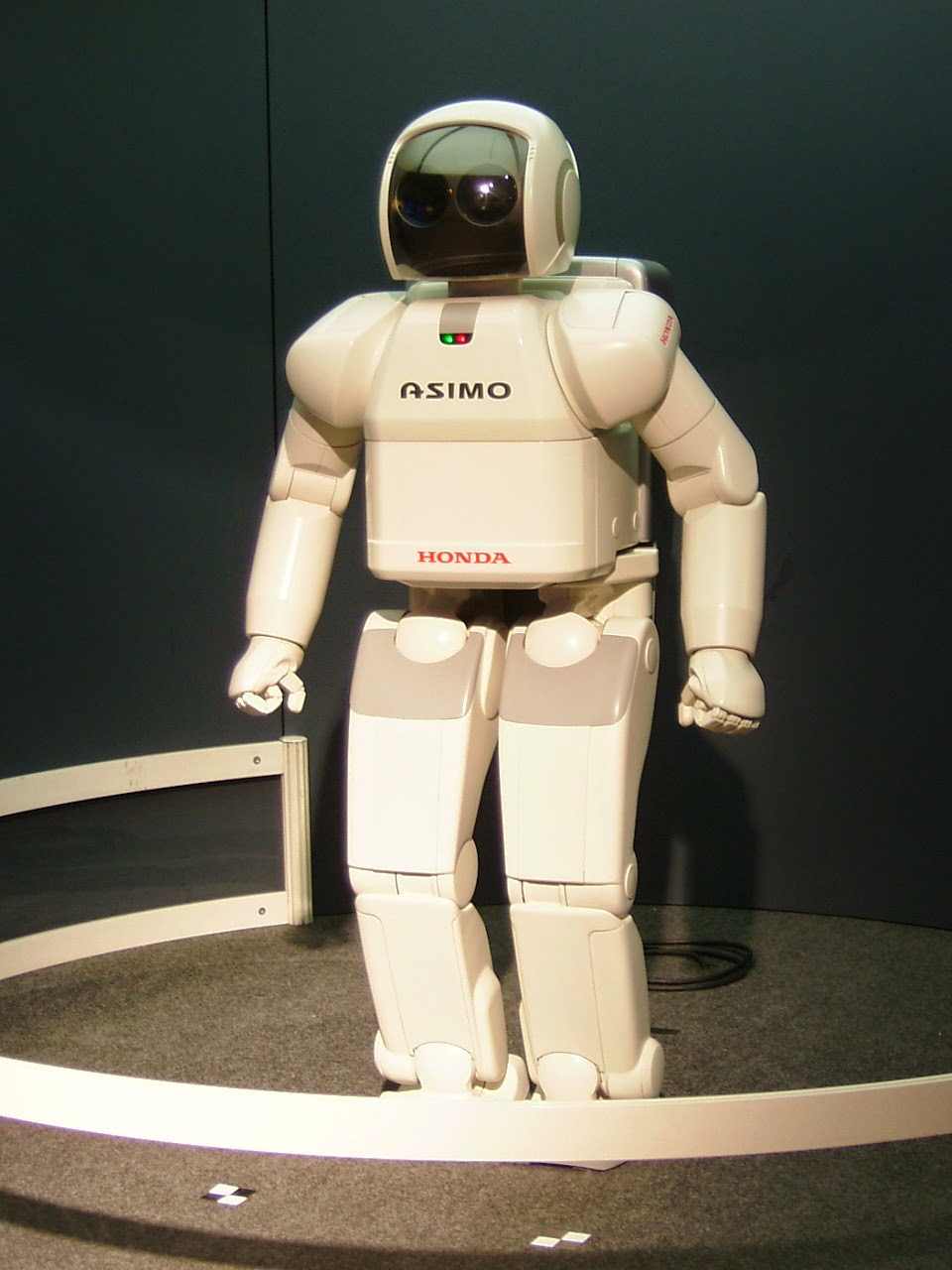
Of course they were pretty well placed to make them, having ruled the roost in computer technology and robotic engineering for the last thirty years and are a fairly dogged and stubborn race in more ways than one.  And so, the Internet is swarming with pictures of the various toy robot dogs that are available.  They don’t do anything but walk or trot around, (I think they are sometimes employed in five-a-side football teams,) and look in varying ways like (or unlike) dogs.  And of course, humanoid robots are everywhere.  Take Honda’s Asimo project. 

  Asimo, (Advanced Step In Innovative Mobility) is a strange, huddled looking robot, about the size of a ten year old, but which has achieved some extraordinary goals.  It can walk up and down stairs, kick a ball, do an approximation of running, and greet presidents of the USA as seen in the picture. 
 
Asimo greets president Obama.  Public domain.
But my flippant tone isn’t intended to disparage the work.  Asimo (with the correct software) can even recognise faces and small objects such as toy cars and can then retrieve a specific toy car from a group of cars of different types. So he examines the toy, remembers its shape and can then go into another room and from a table of other toys find the exact car.  These tasks must have robotics scientists tearing their hair when they try to explain to the rest of us just how significant that it.  It doesn’t seem like much when you just write it but we are seeing the robotic future being built before us. 
 
Asimo. Wiki commons.
 Today’s designs are simple line designs again, inspired mainly by the Japanese dog toys; the ones at the top of the page are fairly early tryouts against a yellow background with a nice gold glow.  Easy to draw freehand, pencil on paper but they look a bit rough on examination.  I am always looking for my clean line and so redrew them all digitally, giving them a nice blue finish.  I shall probably change that (remember CMYK colour doesn’t do blue very well) but it looks well in red, and green will work well too.  The actual dogs, like modern cars are invariably silver, but that won’t necessarily work as I’d have to do it grey.  They’ll all have glowing eyes though. 
Would you like this design on a t-shirt, mug, mousepad or bag?  Just click on the picture.
Asimo is completely white except for a black faceplate, and looks like a miniature NASA spacesuit with a mind of its own, and I suppose that one day they will actually put astronauts out of a job, or at least make them into desk bound remote viewers, pushing buttons on earth while the robot does the work in space.  But of course we should remember those seventies boffins who told us that robots don’t need to look human – they certainly won’t need to in space. 

And they said valve technology was dead!
My humanoid robot designs are similar in approach to the dog ones, and look a bit like Asimo, while I was researching pictures, I found an image of a very similar robot playing the trumpet, but I did mine long before I saw it.  Honest.  And even as I write another robotics laboratory in Japan is designing another robot dog.  They really want them – really.

My Zazzle site

The Implounge. 

Saturday 4 April 2015

'For you have supped your last Grendal...'


The words of the title of this blog were written by Eleanor Farjeon, and it comes from a book she wrote in two volumes for children in the 1920’s called ‘Mighty Men’.  The book is an introduction to the stories of the great heroes of history and legend, the first in the second volume being the story of Beowulf, which Farjeon entitles ‘Grendal the Monster’.

Eleanor Farjeon.  1881 - 1965    Public domain.
 In this story Farjeon gives a simplified retelling and ends as with all the other stories in the book with a short poem, which sums up all that has previously been told.

The last verse:


Grendal fled from Heorot
With golden splinters strewn,
But the fair hall stood without a blot
Before the next night’s moon.
Now clear and strong rose sounds of song
Instead of sounds of wrath -
“For you have supped your last, Grendal!”
Said Beowulf the Goth.

Thrilling stuff when you’re six or seven years old.  In the book there were illustrations by an artist unknown to me named Huge Chesterman, and the one showing Grendal seriously put the frighteners on me when I was small.  I remember I used to turn two pages over to avoid seeing it.  Here it is in all its scary glory.

 
Drawing by Hugh Chesterman.  Public domain.

 Well, as an adult I’ve stopped trembling now and can look at it in a more subjective way as a picture and an illustration.  It was certainly effective on children, but now I don’t think it’s a particularly good image of Grendal.  Why?

Well its too Greek for one start, too classic.  Grendal is shown as a satyr or Pan like figure which has nothing to do with the norse tradition, and he looks altogether too spindly, as if a strong wind would knock him over.  (I felt the same thing about the 2007 animated films depiction of the monster – too flimsy.)  Also, the background of Chesterman’s picture is reminiscent of a Greek or Roman setting with its classical temple buildings and tall cypress trees.

In the poem Grendal is obviously huge.  I quote from Michael Alexander’s 1973 translation of the poem: 

‘…he grasped on their pallets

thirty warriors…’ 

and these are not ‘take aways’, he doesn’t charter a bus to take them back to his home to eat, he eats them there and then.  Respect.  I vote Grendal top monster.

And later as Beowulf waits to ambush Grendal – Grendal bursts into the hall, snatching up a warrior and immediately eats him; the poem states that he chews on the bone joints, sucks on the veins, swallows huge gobbets of flesh and completely consumes the man – hands and feet.Now that’s what I call a monster.

You knew this was leading up to something, and yes, it’s my chance to show off – showcase is what I meant to say, work I’ve been doing on the theme of Beowulf.  I picture the hero in a sort of ‘selfie’ moment, posing near the door of an outhouse where the head of Grendal is being displayed to the people.  Its digital, and one of my more finished images, the original drawing was made large on paper with pencil and scanned before being digitally coloured.

 
Development of the Grendal head from drawing on extreme left to overlays of colour in middle to full colour.


The background needs a complete rethink (that's why there isn't any) as you start off thinking you have a plan, and then you change your mind.  The main figures are okay so I'll leave them, but I need to better think out interior details, and other figures that I had initially intended to put in. 
Beowulf drawing details.
 

 Yes, I accept it’s a work in progress, and the background is almost non-existent, and the sword is only a place saver for want of a better one.  But it gives me incentive, if I undertake to show the more finished work – to actually do that work at some time in the future.

Work so far.  The wood in the background is just to give him something to pose against.