Saturday, 30 May 2015

Painting the Lions of Nectanebo.


This exercise is intended as a guide for anyone with a desire to do a bit of painting, who has a little skill, and doesn't mind following my dry and slightly erratic instructions.  It's not meant to be the last word on anything, but only meant as a 'tryout', something that might be followed for as far as is desired.  It might be possible to pick up a few useful points along the way - but if not, then at least we got our paint boxes out and had a try.

If I'm going to colour a real drawing on real paper or board - with real paint, I usually start with a ground colour, and for me, my preference is always yellow ochre.  This is an excellent neutral colour that can be used in many ways, (not least as a component of flesh colour) as a background colour its useful because it can be used to 'kill' almost any other colour (therefore good for painting over things and making corrections), and its light so it won't obscure a drawing if its applied as a thin glaze.  It's also good for drawing onto as the lines stand out well against it.

I either paint in gouache or acrylic (rarely in oils or watercolour - too complicated) and all types of painting have their pitfalls, you just have to know them.  With acrylic you have to remember that it's a form of coloured liquid plastic, and that once it's allowed to dry - that's it.  When dry, it can be successfully scratched off glass, hard plastics, and polished wood but get it on clothing and that's another matter. If you get it on clothes that you care about, you'll have to completely immerse the garment in water and start scrubbing right away - run, run - don't let that paint get a chance to dry.  But as they say in the old books - I digress.

I'm going to use acrylic for this exercise, because it dries very fast and because of this I shall be using it more like watercolour or gouache in that you can apply it in dilute form in thin washes.  When you put the colour on thinly you can see the drawing lines through it.  Also, the wetter the paint is, the more time you have to do things with it - such as blending or mixing more colour in to it on the surface.  The board I'm using is Daler Rowney Line and Wash 'Fine', and I'm using five paints, namely -  yellow ochre, ultramarine blue, burnt umber, titanium white and burnt sienna.

So I will paint a layer of thin dilute yellow ochre over the entire drawing, and then wait for it to dry out completely.
The original drawing, with a thin wash of yellow ochre.
When it is dry, (shouldn't take more than ten minutes - depending on how much water you mixed with the paint) we need to start to re-define the lines of the drawing by using a darker paint to accentuate the more important lines.  It is up to the artist to decide what colour they want to use for this; I usually use burnt umber, raw from the tube and mixed with enough water to keep it smooth and not too dark.  Its a slow easy process of building up an image, the shading and cross hatching lines of the drawing can be ignored, they are important if you just want the drawing as they help to give form, but less so in a painting process.

The main outlines of the drawing darkened with burnt umber.
It's all about washes, and touches of less watery paint to give shadow and depth.

As we apply watery washes onto certain places, we have to be ready to use a large brush dipped in clean water to help smooth the edges of paint areas.  Remember acrylic will dry with a strong edge, and it may be difficult to get rid of the edges later.   Throughout the painting process you should be using brushes to smooth out all paint edges, so that a smooth transition between areas may be achieved.

Always check that your main lines are still visible, and haven't faded away under the washes of other paints already applied.  Go over them with darker paint if they need it.  About now we can go over some of the deeper shadow areas with a darker colour, and I would use burnt umber mixed with ultramarine to get something that looks almost black.  Painters rarely use real black as it's a very deadening substance, which doesn't mix well with other colours except in minute quantities.

This darker paint should be used to accentuate particular points on the drawing to emphasise shadow and bring the image forward.  At this stage what you should have is a flat yellow ochre square over the original drawing, with the drawings main lines  over-painted with a darker colour, and the lines of the main shadow areas painted in with a very dark brown. 
 
What we have at this stage - a yellow ochre covering, with an umber outline, and with the heavily shadowed lines darkened using a mixture of umber and ultramarine.

Now we can begin to use washes of paint to bring out the form.  Although the finished image is a colder grey brown, it has like many things, warmer colours showing on its surface like yellows and red browns.  It's easier to place these colours down at the beginning and let them 'bleed' through than try to apply them later.  As I said earlier, its a process of building up with layers of wash.  So I will now delineate shadows with washes of brown/yellow, created by mixing yellow ochre and burnt sienna with a lot of water.  The consistency you need is so the paint is like a puddle of melted butter.  If the colour seems too rich then quickly mix in more water. 
 
The first washes are applied.

But to move on, we need now to introduce some colder colours to help with darkening the deepest shadows.  I mixed burnt umber, ochre and ultramarine to make shadow washes on the left side of the head applied with lots of water, always using the brush to smooth out the edges.  Note that as we go on, the original lines and crosshatching begin to disappear under the colour washes.
 
Darker washes are applied at left side of head, under nose and chin.

The washes should be concentrated under the lion's cheekbones, under the chin, along the left side of the head, down the left side and under the nose and around the sides of the muzzle.  The light is coming from the right, so shadow is strongest on the left.  Put a little wash in the eye sockets and also into the hollows of the ears.

As in watercolour, I've tried to use the lightness of the board, allowing this to show through for the lightest parts of the face, such as the nose, muzzle and chin.  As you progress and build up the layers of wash, you have to keep asking yourself if you like it with a thin layer of paint, where you might still see some of the underlying drawing showing through.  The drawing showing is not wrong, but a little thicker paint here and there might be more to your taste.
 
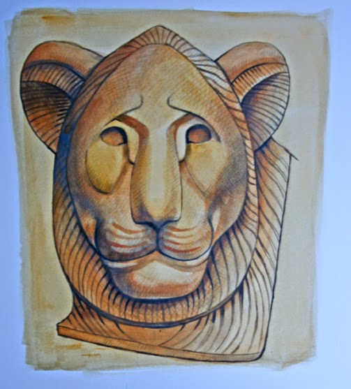
The finished lion.

In the finished image I've put a little white onto the top and tip of the nose, a trace along the bottom lip and used some white mixed with yellow ochre on the right cheek and on the whisker lines of the muzzle.  As you can see, quite a lot of the drawing can be seen, especially at the top right of the head, near the eye and around the cheek, but it would be easy to cover these lines sufficiently with washes of slightly thicker paint content.

Well if you've struggled through my dodgy account and peered at my questionable photography to this stage you are to be truly congratulated, and I hope that you can come away with at least something that's half useful.

See my zazzle page 

My website 

Saturday, 23 May 2015

Drawing the Lions of Nectanebo

This business of drawing, I've pretty much done it all my life, and can scarcely remember a time when I wasn't doodling something, or trying to draw something I knew I couldn't really draw well but doing it anyway.

 I forget in this age of the image, when we're perpetually bombarded with photographs and moving film and computerized images that simple drawing still interests people.  I've found myself mildly surprised when drawing something for my own amusement, to find that someone is looking over my shoulder. It's an ancient form of entertainment.

People like to draw for relaxation, which is scarcly the way I've seen it - it was just what I did. So a little practice anyone? Drawing an Egyptian sculpture? Ok... 

For this project I have chosen an Egyptian sculpture known as the Lion of Nectanebo, which currently is under the curatorship of the Vatican Museum in Rome.  The original photo can be found here.
I think that sculptures in reality or in photographs are a good source of practice for a beginner artist, and in the past students drew from plaster casts of famous sculptures as a matter of course. Some people think that tracing from a drawing or photograph is okay, but it is always better to draw something freehand. You will learn more about controlling the pencil, about judging placement of lines and it will help you better understand what you are drawing.
Firstly I want to define the structures of the sculpture.


The original sculpture, with construction lines.


The original photograph can be found hereNote how the sculptor has brilliantly captured the important shapes that make up the lion face. At first they might seem complicated, but if you study the shapes singly they are quite simple and clean, good solid monumental forms that are easy to understand.  I am going to make a fairly large drawing on board, beginning with the basic outline of the head, an oval shape, slightly pointed at top.


The basic shape of the head.

So now we begin to place in the important lines, using the above photograph as a guide, paying attention to the red guidelines. These are the supporting structure of the image. Study the image below in red showing the three basic shapes. Note that the lines of the mouth in the original photo show a strange structure just under the mouth. This is actually a hole placed into the sculpture to receive a water pipe, either by the classical or medieval Romans, so that it could be used as part of a garden fountain. For the purposes of our drawing we'll ignore it.


The facial structures

The three basic shapes of the face.

 Part of drawing is learning the accurate positioning of structural lines, these are the lines that make a 2D drawing hold together.  When drawing the lines try to be aware of the points where the lines start and end – this will help with positioning.  For example the lines of the mouth start below the nose, but must end almost at the edge of the original oval shape.  If you’re trying to draw something accurately every line in a drawing must be scrutinised for correct positioning. Do things line up?  Are they on the correct level?  If a line is curved, what exactly is that arc doing?   How close is it to other lines?  Use straight lines to make sure elements line up with each other correctly.


The shapes of the face placed on to the original oval. Ears included.
Some adjustments are always necessary so use a light hand and have a clean eraser near by. There’s nothing wrong with mistakes.  When I was a kid I was sometimes told never to use erasers – you were miraculously supposed to always get it right first time!  This is impossible. Do what you have to do to get a decent image.  Imagine a centre line running from the point at the top of the head straight down through the chin. This can be used to help position marks on the paper; it’s a kind of anchoring line that helps in judging distances between elements. Some artists prefer to use a grid, which they place over a photograph and this helps in the same way. The fact that the lions face is very symmetrical also helps.  I include the main features of the face with a grid applied to emphasise levels and the 'blocks' that the forms make.


The features within a grid.  
The outline of the image is finished with the inclusion of the mane.


Lines of the head, including ears and mane. Compare with photograph above.

To make the forms seem more real and rounded they need to be shaded. I shall use crosshatching, an effective way of applying shading and texture to an image. Depending on the style, different effects can be obtained and the direction of the lines used, help to delineate the form.


Hatching on the left, cross-hatching on the right

Crosshatching should be accomplished without very much movement of the arm; you should be able to rapidly line a section of an image using just small rapid movements of the fingers and thumb.   Do it with confidence.  Shading with lines is also about using visible or dark lines and fainter lines, which are made with a light touch.  When making an area of dark shadow, the lines made must be dark and heavy; the lines in lighter areas should be made with fainter lines to achieve a graduation of shadowing.  So after erasing and cleaning up the centre line and any other construction lines, I will start to delineate shapes with short straight lines like this.


Hatching applied to the lion face.

All of these lines start from the lower left hand corner moving upwards and to the right.   This is to simulate a light source hitting the face from the upper right.  Note how denser patches of darkness can be achieved by closer together strokes – as in the shadow in the ears.   Facility and confidence in this can only be achieved through constant practice.  But this is just hatching. Single lines going in one direction. Crosshatching as the name suggests is when lines cross over each other, and has been used by artists to give form to drawn images practically since art began. To shade with just hatching lines can make the image seem ‘samey’ and flat, to get more depth in the shadow and a feeling of texture, roundness and complexity to the surface then cross hatching is needed.  We proceed to place more hatching lines as shading on to the drawing.


More hatching starts to bring out the forms.

This is where we begin to use the method of cross-hatching, placing lines crossing over those already in place, these lines starting in the lower right and moving to the upper left. This cross-hatching will darken the areas where it is placed, giving more depth and texture, for example, the shadow under the chin, and the ears.  The lines can curve slightly to suggest form.   However they don’t need to be curved, a good sense of roundness can be achieved entirely with straight lines applied in the correct way.

A little cross-hatching is introduced, in the ears and under the chin.

Now we begin to apply cross-hatching on the cheeks and forehead to give the image increased depth and roundness.   It’s a matter of building up the level of shading until the image begins to ‘come forward’ and the forms we originally outlined in red are as well defined as we can manage.
Cross-hatching is used extensively, to darken and give roundness and texture.

In the last stage we finish the shading, applying lines to almost all the head, leaving areas free where the most light would be seen, on the forms that project out the most like the nose, snout and cheekbones.  Note how some of the darker shadowed areas under the nose and ridges over the eyes are made with very short very heavy lines, to emphasise the shadow.  The lines making the grooves on the snout where the whiskers are are all made from many short lines applied in a curve.


The finished lion with extended mane.
That's about it.  Next time, we'll look at colouring it.


Zazzle

My Website


Saturday, 16 May 2015

A real case


Kindles are fun and convenient, and I own one that has a nice robust black leather case.  I suppose I could custom paint the case but I am content with it as it is.  What would I paint on it?  Which character would please me?  I could do it with someone else's case if I knew what was wanted and in fact various web sites have started up to accommodate the case market, and some very odd images they have on some of them too.  I immediately felt that a reader would want a character or location from a favourite novel on their case.

This would be easy with older books that were out of copyright, and I looked at some of these sites hoping to contribute.  But the one I thought I might have a go with either went out of business or stopped the 'artist designed case', and went down the DIY route.  Hmmm, slippery ground.  The work I had been doing for them is still on my hard drive.  Again, it's character driven and illustrates old novels.  I recently read 'The Pickwick Papers', not, I have to admit, expecting to enjoy it - but found it to be brilliant stuff, charming, amusing and inventive from beginning to end.  So I promptly did two designs based on this novel.


'Let me tell the defendant Pickwick, if he is in court, which I am informed that he is, that it would have been more decent, more becoming, and in better taste, if he had kept away!'
I had seen the very underrated British film based on the novel, made about 1952, and this may have helped my appreciation of the book.  This is rare of films that usually fall very short of the book, but as the film has high production values and relies on Dickens' dialogue for its script pretty extensively; the finished product reflects the book pretty dam well.  It cuts out a few characters, but this doesn't harm the story such as it is, because the plot is fairly trivial, its one of those books that rely on verve, wit and charm to power you through to a feel-good end. 

The film chooses the cast well, making sure they realy resemble George Cruikshanks illustrations, using costume, hairstyles and lighting to great effect.  Donald Wolfit, an actor much derided over the years, was born to play the lawyer Mr Sergeant Buzfuz, he does an excellent job, and I had him in mind when I drew the character, with some of Buzfuz' speech included.  This image was designed around a case template supplied by the company I mentioned, and its their 'box' shape I had to design within.  I'd like to show the case as well, but I'd better not.  I've drawn a line around the case so you can see where it is.

The other Pickwick design I drew was of Sam Weller, and I chose the moment that Pickwick and his companions first meet Sam outside a hotel, where he is blacking boots and shoes.  Again, I would include dialogue from the book.


'You're a wag aint you?' - 'My eldest brother was troubled with that complaint', said Sam, 'Maybe its catching, I used to sleep with him.'
Lastly, Dracula, everbody's favourite vampire, and I obviously wanted a dark and brooding look for the image.  I've always liked a passage early in the novel where Dracula is describing to Jonathan Harker just what incredibly great nobles his ancestors really are!  He goes through a speech where he refers to 'mushroom growths' like the Hapsburg's and Romonov's, and how the Dracula's make them all look dog rough.  Then he finishes with a brooding but almost self- pitying line - 'I like the shade and the shadow, and would be alone with my thoughts when I may.'


'I love the shade and the shadow, and would be alone with my thoughts when I may.'
But the image is the thing, and I suppose the dialogue could be changed a hundred times over.  Will I actually put these designs up at any time?  Maybe on Zazzle, but they were not designed for their range of cases and I don't think they do any for Kindle - I'll check of course but in the meantime I'll keep investigating.

Implounge

Zazzle 

Saturday, 9 May 2015

Sphinx 2


Yes I’m well aware that the title sounds like the sequel to a particularly bad movie, but this is part two.  A week has elapsed and the sphinx is finished, although I still have that feeling that always hovers over you at the end of any project – that it could be better, and just a little more work would put it right (or put it wrong). 

 I know that more work on something when it seems to have finished can go either way.  You might hit on that elusive thing that makes all the difference, or you will do something (and often you’re not even sure what it is) that ruins it for you completely.  And you’re the one that matters in the end, your opinion.  Others may not even see a difference in the work – but you’ll always know that you almost had it right, but then ruined it. 

The line work at the bottom is looking a bit rough compared with the head.  Also it doesn't look balanced.

 I mentioned last week that I thought the design was in danger of being top heavy in detail and this is still one of the vague problems that are still slightly nagging at me.  There’s a lot of line work involved in the hair and wings, coupled with the fact that the human eye will always go to the face first.  In comparison the rest of the body has little line work to help it along. 

Its another one of those remarkable things about the human brain, that we will see flat two dimensional lines as representative of solid three dimensional objects, and without them a flattish colour based design is in danger of receding, and losing form.   I could only try to mitigate the problem by giving the body more form using blocks of shade.  What line there was defining the body was also in need of some work.  My first attempt wasn’t that great, a bit awkward in fact, and I needed to adjust the angle and line of the body between the legs, and the angle of the line of the haunches just behind the wings.  (See above.)  This helped it conform better to my original conception of a square like design, which would fit into a frame.  
 
Detail of the wings - and all those little fibres.
Another thing they don’t often talk about with art or illustration is the tedious work that some of it involves.  And I’m talking about the wings here, as I had started to draw in the thin fibres of the feathers and had to complete the task for every feather.  It wasn’t too bad this time, but I have locked myself into one of those seemingly endless tasks in the past.   The Sci-Fi artist Jim Burns talks amusingly in his collection ‘Transluminal’  about a similar but more testing problem for his book cover for the novel ‘The Long Run’. 

Getting close, but still some shading to correct, and some more sculpting of form.
 Lastly I wanted to slightly adjust the grey border, to make it narrower and longer.  I had originally wanted the front leg of the Sphinx to cross over the border but the positioning of the main form was too central, so I shifted it over to the right and lengthened the borders.  I wanted to put a title with it and so saw the opportunity for a box for this text to be made with the border. 
 
The finished article.  Click the picture and see my website.
And here's the finished piece, complete with a title in a box.  I'm never really happy with anything I do, so there's room for future work.  Maybe I might feel it would look better as a longer shape at some time and so I'll begin to break it out of its box and give it a more supple and elegant shape.  Would it look better?  I'm sure you all have an opinion, but only I and the sphinx have the real answer to that riddle. 

Zazzle 

Flickr

Saturday, 2 May 2015

Sphinx


I’ve mentioned before that I really like Art Deco, appreciating its cosmopolitan ways, in taking from anywhere and everywhere – and everywhen.  It has taken elements from all cultures and all time periods and blended them together, usually in to a highly successful whole. 

Ancient Greece was an obvious target for Art Deco artists to re-use and the sphinx, a mythical creature common to Greece and Egypt easily attracted their interest.  Deco was influenced by Egypt as well, so they had no shortage of sphinxes to choose from.  I’m going to tackle a Greek style sphinx, as might have been imagined in the thirties. 

 Almost all materials were used by Deco artists, as it was an arts and crafts movement, so when I began to design and develop a digital image in the style I chose to make it look like a polished steel or aluminium sculpture in repousse or hammered metal style. 

I imagined a kind of plaque like decorative sculpture of the type found commonly in decorative material for buildings and interior spaces in the twenties and thirties.  You can also see these sorts of design in Deco glass and stoneware.  They’re often attached to buildings over doors or windows, or pressed into glass partition panels, and this is a long-term form for the decorative arts.  Only Deco seems to have done a great deal of this kind of thing with metal.
 
Beginning the drawing.
  I started with a drawing of the face and head, because I wanted it to look right for a Deco design, with the hair that might have been seen in the thirties (where a sphinx gets her hair done is anybodies guess – but they must be one hell of a hairdressers,) and the rest of the design – as always grows out from this. 

 I knew the hair was going to give me trouble.  It always does.  Designing flowing hair, or draperies for that matter is always difficult, and you’re almost never happy with it.  I rubbed out the hair several times because it looked lame, concentrating less on spiral like shapes and more on flowing locks of hair.  I’m a little concerned that the hair will look separate from the rest of the design, too intricate, with nothing to balance it.  

The overall design was going to be a squareish form, so that all the elements of the figure fitted into a block.  This would make the figure seem squat but this is a form that Deco often experimented with for its figures.  So for instance, the outer line of the face follows the same line as the outer edge of the body. 
 
Progress on the hair.
  The wings are next, naturally forming from the rest of the work, as if the upper part of the design has to be finished first.  I find it interesting to see what parts of an image naturally form first, and why we always find ourselves progressing to very particular parts of a design, always finishing them first before moving on; and of course, everything has to fit into that box I’ve set myself to work in.  
 
The wings form.
 The wings are work intensive, just getting the curves correct is a little difficult and they have to look a particular way.  I suppose its derived from not only classical sculptures, but medieval and Neo Classical ideas.  Sculptures of everything from sphinxes to griffins to angels have almost a set of rules for wings.  I won’t say I know those rules, but I’m trying to conform to that look in hopes I’m doing something right.  I can’t help putting a little colour (if tones of grey can be termed colour) on to the image, even without it being finished – just to see.  Next week I’ll say something about the completion.


Saturday, 25 April 2015

Those mermaids again.


Mermaids are popular girls; images of these leg-challenged ladies always attract interest.  Some of the highest hit rates on my Flickr page are for the mermaid designs, so obviously I thought – I’ll design some more. 

The Art Nouveau artists of the 1890’s were nutty about mermaids, and they went to town on the swirly hair and a type of stringy seaweed, which I think is called ‘Bladderwrack’.  (It is, I just looked it up – Fucus Vesiculosus.  There – don’t say I never tell you anything.)  

Though interestingly, if you put the keywords ‘At Nouveau mermaids’ into Google, then go to the images tab, almost all of the so called Art Nouveau pictures are modern.  What this says about Google or us, I don’t know.  Only after scrolling to about half way down the page do you find any real 19th century works, and they’re few and far between.

Some of the real swirly girly Art Nouveau by Alphonse Mucha.  Public domain
  So I suppose we like the ‘idea’ of Art Nouveau more than we like the actual stuff.  Which is lucky for me as I now intend to add to the ever-growing heap of fake Art Nouveau.  

For this design I had intended on a circular effect, but I couldn’t make it work.  I’d wanted to rotate copies of the figures I designed around a circle and have them interlock together.  Fat chance of that.  It would need more work on the design.

At the top of the page is a small scan of a rough pencil drawing, one of many, which help to try things out and define an idea.  I then drew on paper a bigger version with both figures and scanned it so that I could use it as a template.  I put the scan on to a layer, and then bringing down the opacity so the drawing was just visible, created another layer on top so that I could then trace the drawing through.  

Left, the line drawing, top right, tracing over the original drawing, bottom right, colouring.
You have to zoom in on the work and draw with a thin pencil tool line, but when you know you can correct mistakes easily its not too stressful.  I used black for the outline, and a darkish grey to put in line shading.  Then, it's just a matter of adding a layer below the drawing and applying colour.  I'll admit its not exactly as I envisaged it but I've improvised a simple background (which I may change) and for the moment its finished.  Here it is.
Finished, with space for a caption.

And here's a link to my Zazzle store.


Saturday, 18 April 2015

A ghost of an idea.


This blog I suppose is at the wrong end of the year, as it should coincide with Halloween, but this little poem, or limerick floated into my field of vision and I immediately thought ‘I could design something for that'.

Three little ghostesses,
Sitting on postesses,
Eating hot buttered toastesses,
Greasing their fistesses,
Right up to their wristesses,
Oh what beastesses,
To have such feastesses.

I’ve always liked that image, three ghosts sitting on posts eating toast.  What’s not to love?  It’s not exactly T.S.Elliot but it gets its message home in a clear and direct manner.  However there are some quite ambiguous things about the whole piece, for instance, that first line.  Three little ghost-esses?
What do ghosts look like?  This is the dreaded (and rather ridiculous) Smithfield Ghost.  The Welcome Trust.
 Does that imply that they are female?  But as ‘esses’ appears at the end of each line maybe not.  But it does raises the issue of what ghosts are supposed to look like anyway.  Before you draw anything, you have to know in a general way what it looks like.  This is what M. R. James thought about the ‘look’ of a ghost 

‘What first interested me in ghosts? This I can tell you quite definitely. In my childhood I chanced to see a toy Punch and Judy set, with figures cut out in cardboard. One of these was The Ghost. It was a tall figure habited in white with an unnaturally long and narrow head, also surrounded with white, and a dismal visage.


Upon this my conceptions of a ghost were based, and for years it permeated my dreams.’
 
M. R. James.  (1862 - 1936)  Wiki commons.

So that was James’ idea of their appearance, and as he was born in 1862 it was probably the prevalent nineteenth century conception.  Our modern idea of a ghost looks more like the ‘Caspar – the friendly ghost’ variety, but where did that come from?  I suppose he derives his appearance from the typical bed sheet with holes cut in for eyes.  I think those late 19th century ghost fake photographs also informed our modern idea of a ghost – people dressed in long white robes, double exposures and all that stuff about ectoplasm.


 A little while ago I did these cartoons of ghosts in the modern style.  I think they derive something from the film ‘Ghostbusters’ in its realisation of ghosts as more coloured ectoplasm, the light gleaming and rippling on their surface, more bloated jelly than amorphous will ‘o the wisps.
 
My kind of ghost, chains, flaming torches, skulls and little Vandyke beards!
 There’s also a little of the past about them, traditionally ghosts are always supposed to cry ‘vengeance vengeance’ or ‘woe is me’, they clasp their hands in anguish and of course where is any self respecting ghost without a number of chains to rattle?   They also often carry torches, have ropes around their necks and might just possibly carry a club. 
 
A toast!  To toast.  I love toast

I've been doodling some tryouts for the nursery rhyme at the top of the page, and its a bit more difficult than I expected, so nothing finished yet, but here's the sketch.  It will become the basis for a design for my Zazzle shop, and in the meantime why not visit it by clicking on the photo.