
This exercise is intended as a guide for anyone with a desire to do a bit of painting, who has a little skill, and doesn't mind following my dry and slightly erratic instructions. It's not meant to be the last word on anything, but only meant as a 'tryout', something that might be followed for as far as is desired. It might be possible to pick up a few useful points along the way - but if not, then at least we got our paint boxes out and had a try.
If I'm going to colour a real drawing on real paper or board - with real paint, I usually start with a ground colour, and for me, my preference is always yellow ochre. This is an excellent neutral colour that can be used in many ways, (not least as a component of flesh colour) as a background colour its useful because it can be used to 'kill' almost any other colour (therefore good for painting over things and making corrections), and its light so it won't obscure a drawing if its applied as a thin glaze. It's also good for drawing onto as the lines stand out well against it.
I either paint in gouache or acrylic (rarely in oils or watercolour - too complicated) and all types of painting have their pitfalls, you just have to know them. With acrylic you have to remember that it's a form of coloured liquid plastic, and that once it's allowed to dry - that's it. When dry, it can be successfully scratched off glass, hard plastics, and polished wood but get it on clothing and that's another matter. If you get it on clothes that you care about, you'll have to completely immerse the garment in water and start scrubbing right away - run, run - don't let that paint get a chance to dry. But as they say in the old books - I digress.
I'm going to use acrylic for this exercise, because it dries very fast and because of this I shall be using it more like watercolour or gouache in that you can apply it in dilute form in thin washes. When you put the colour on thinly you can see the drawing lines through it. Also, the wetter the paint is, the more time you have to do things with it - such as blending or mixing more colour in to it on the surface. The board I'm using is Daler Rowney Line and Wash 'Fine', and I'm using five paints, namely - yellow ochre, ultramarine blue, burnt umber, titanium white and burnt sienna.
So I will paint a layer of thin dilute yellow ochre over the entire drawing, and then wait for it to dry out completely.
 |
| The original drawing, with a thin wash of yellow ochre. |
 |
| The main outlines of the drawing darkened with burnt umber. |
As we apply watery washes onto certain places, we have to be ready to use a large brush dipped in clean water to help smooth the edges of paint areas. Remember acrylic will dry with a strong edge, and it may be difficult to get rid of the edges later. Throughout the painting process you should be using brushes to smooth out all paint edges, so that a smooth transition between areas may be achieved.
Always check that your main lines are still visible, and haven't faded away under the washes of other paints already applied. Go over them with darker paint if they need it. About now we can go over some of the deeper shadow areas with a darker colour, and I would use burnt umber mixed with ultramarine to get something that looks almost black. Painters rarely use real black as it's a very deadening substance, which doesn't mix well with other colours except in minute quantities.
This darker paint should be used to accentuate particular points on the drawing to emphasise shadow and bring the image forward. At this stage what you should have is a flat yellow ochre square over the original drawing, with the drawings main lines over-painted with a darker colour, and the lines of the main shadow areas painted in with a very dark brown.
 |
| What we have at this stage - a yellow ochre covering, with an umber outline, and with the heavily shadowed lines darkened using a mixture of umber and ultramarine. |
Now we can begin to use washes of paint to bring out the form. Although the finished image is a colder grey brown, it has like many things, warmer colours showing on its surface like yellows and red browns. It's easier to place these colours down at the beginning and let them 'bleed' through than try to apply them later. As I said earlier, its a process of building up with layers of wash. So I will now delineate shadows with washes of brown/yellow, created by mixing yellow ochre and burnt sienna with a lot of water. The consistency you need is so the paint is like a puddle of melted butter. If the colour seems too rich then quickly mix in more water.
 |
| The first washes are applied. |
But to move on, we need now to introduce some colder colours to help with darkening the deepest shadows. I mixed burnt umber, ochre and ultramarine to make shadow washes on the left side of the head applied with lots of water, always using the brush to smooth out the edges. Note that as we go on, the original lines and crosshatching begin to disappear under the colour washes.
 |
| Darker washes are applied at left side of head, under nose and chin. |
The washes should be concentrated under the lion's cheekbones, under the chin, along the left side of the head, down the left side and under the nose and around the sides of the muzzle. The light is coming from the right, so shadow is strongest on the left. Put a little wash in the eye sockets and also into the hollows of the ears.
As in watercolour, I've tried to use the lightness of the board, allowing this to show through for the lightest parts of the face, such as the nose, muzzle and chin. As you progress and build up the layers of wash, you have to keep asking yourself if you like it with a thin layer of paint, where you might still see some of the underlying drawing showing through. The drawing showing is not wrong, but a little thicker paint here and there might be more to your taste.
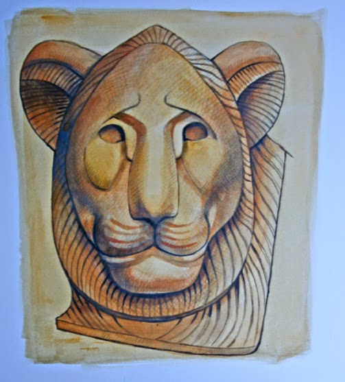
 |
| The finished lion. |
In the finished image I've put a little white onto the top and tip of the nose, a trace along the bottom lip and used some white mixed with yellow ochre on the right cheek and on the whisker lines of the muzzle. As you can see, quite a lot of the drawing can be seen, especially at the top right of the head, near the eye and around the cheek, but it would be easy to cover these lines sufficiently with washes of slightly thicker paint content.
Well if you've struggled through my dodgy account and peered at my questionable photography to this stage you are to be truly congratulated, and I hope that you can come away with at least something that's half useful.
See my zazzle page
My website
No comments:
Post a Comment