Showing posts with label "artistic influences". Show all posts

Saturday, 8 August 2015

Under the influence.


When I was seventeen I saw a copy of Alessandra Comini's Book on Gustav Klimt.  It was the first time he had come to my attention and that magical effect that I was talking about the week before last took hold of me again, where you are swept along by an artists work and just can't get enough.

I think most people aren't all that interested in art, so they experience the same effect through popular music, and the following of a particular band or singer but it is essentially the same thing.  You become a super fan.  A young artist might follow bands as well, but a really interesting artist will grab their attention in a very special way.

Gustav Klimt (1862 - 1918)  photographed by Josef Anton Trĉka.  Wikipedia commons.

Klimt was one of the artists I copied, and learned huge amounts from the study of his work.  He's usually known for his 'gold paintings' but I was as aware of his drawings and poster designs as the paintings.  I particularly liked the Comini book because it was an economically produced colour book - that actually had gold effect printing so that the images of the paintings could really be appreciated, which I suppose for 1977, was pretty adventurous for a publisher.  It seems to have been a success because Klimt's present popularity seems to stem from this books publication.
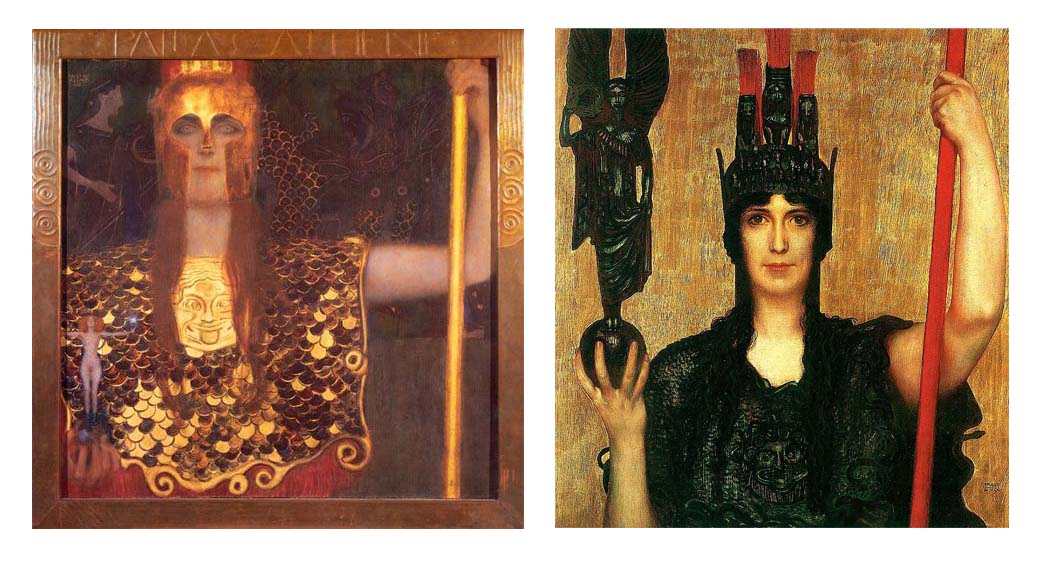
Comini compared Klimt's Pallas Athena (left) favourably with a similar painting by a contemporary Franz Stuck (1863 - 1928).  Klimt's is great and more inventive, but I still Like Stuck's.  Both Images - Wikipedia commons.

For about five years I drew and painted Klimt inspired work until I finally got him out of my system.  It's quite possible that I paint less well now, I won't dispute it and I still think he's great but an influence like that is like having artistic measles.  Its effect is quite obvious.

I mentioned in that last blog how strong the influence of H. R. Giger (1940 - 2014) has been on young artists after 1979, and the introduction of his work to a wider audience through his production designs for the film 'Alien'.  Again I caught the bug, but this time I had a stronger immunity.  Still, it didn't stop me buying the book on the production of the film, a second book 'Giger's Alien' and his book of posters and other designs, 'Necronimicon'.

H. R. Giger.  Biomechanical Landscape (Detail).  One of my favourite works by this artist, and I think one of his most successful.  Here's someone's generic photograph of it.  It's not from a poster site!  Click on it to see Giger's own website.

  But the influence on my own work didn't last anywhere near as long.  I'm not suggesting he's not a worthy artist, but his work is so dark and dank, after a prolonged exposure to it you feel like you're sitting in someones rubbish filled cellar watching water run down the walls.  Having said that, Giger's work can certainly shake you up when you see it for the first time, and make you realise new possibilities.

I suppose that being aware of the strength of influence that some artist may have on your art is essential, but is also challenging because to improve and grow you have to be aware of and be exposed to different approaches and styles.

On the face of it I think they are two strangely different artists to have developed a liking for in the space of a few years, Klimt with his ethereal lovelies and ornate decoration, and Giger with his brutal industrialised images of biomechanical hell.  But then - that's the teenage years for you.  All those hormones make you jittery.  So that's what I was under the influence of all along.

 Website

Zazzle

Saturday, 25 July 2015

Airbrushed skys of blue


Who were the first artists that really fired your imagination?  Back about 1971 when I was eleven I found a magazine (I think it was a copy of the Observer, possibly my dad had brought it home) that featured a spread on the artist Michael English (1941 - 2009)

English started using the airbrush, the ubiquitous tool of the seventies commercial artist, to make hyper real images of ordinary household objects such as buckled coke cans and bottle tops, floating glass bottles and various viscous liquids. It was about the first time I had seen this type of thing and it seemed special and modern and glamorous.  Today its part of the modern visual vocabulary.

It was the first time I had seen water with that kind of translucence done in a realist modern way.  I pored over those seven or eight colour images in the magazine and read and re-read the brief article that accompanied them.  I wanted to do that kind of work, but apart from having nowhere near that skill at eleven, I didn't have an airbrush or the money to buy one.

Bottlecap.  Someones generic photograph of a painting by Michael English, digitally once removed from the original by being downloaded from the internet.   Click on the picture to go to the offical Michael English website.
 Ho hum.  The next artist who came along who really caught my eye was Roger Dean (1944 - ).  I was about fifteen then but wasn't really a fan of those big supergroups that he worked for such as Yes, and Uriah Heep so I don't quite remember when I first saw his art.  I certainly owned his book 'Views' and studied it very closely, but didn't attempt to copy the work, a rarity for me at that time.  I think I recognised that his style was too strong, and would influence too strongly, we can see the same effect on those influenced by the work of H R Giger.

Dean's work was intended to compliment the music of those progressive rock groups who vied to get his art on their covers but as I never brought the record albums I was able to look at his work without that connection.  He might argue that it is required, and others might agree, but I'm not so sure. 
 
'Charge' Cover for Paladin album.  Someones generic photo of a painting by Roger Dean.  Click on the picture to go to the official Roger Dean website.

 They cast a certain magic over my early to mid teens with no music needed.  I still have fond memories of his 'Charge' album cover for Paladin, (which I had as a poster on my wall) his Lockheed Blackbird with a birds skull fixed at the front for the 'Squawk'  album by Budgie and the rattlesnakes and the wedding cake castle he designed for the Yes album 'Relayer'.

The last airbrush artist to swim before my eyes in the seventies was Philip Castle (1942 -), the designer most famous for the poster of the Kubrick film 'A Clockwork Orange'.  I saw this poster on the cover of the record album of the soundtrack and spent time studying it, but as with the others I didn't attempt to copy it for the same reasons.  I didn't see much more of his work at that time, but caught up with him later when his paintings were available in book form.  Having been obsessed with aircraft since my early childhood I quickly appreciated Castle's aptitude at shiny surfaces and streamlined shapes.  And the perfect airbrushed blue skies.


A Clockwork Orange by Philip Castle.   Click on the picture and see youtube interview with Philip Castle.
All of these artists had a kind of sunny blue-sky feel about their work which made you feel good when you looked at them; it might possibly have been my youth that helped them along, but I feel that there was something fresh about them that made them perfect for their time.

My zazzle page

My website

My Flickr page